Jani Jani Priyo, Ea Jebone (I know my dear one, in this life) by Nazrul has been translated from Bengali by Professor Fakrul Alam
Art by Sohana Manzoor
I know, know very well my dear one,
No desire of mine will ever be fulfilled
In my lifetime. Like a water-lily, I’ll shed
In a watery grave. Moon-like, from above
You’ll shed tears. Between us, my bride,
Forever will blow a wind of parting. Forever,
You’ll be heaving deep sighs.  I won’t get to hold
Or grip you close to the heart. And yet,
The moon keeps slandering the lotus. Far away
That you are, how does honey still gush from you?
Stay within my reach, dear night moon of mine,
Though so out of my grip and so untouchable!
My empty heart cries out with desert-thirst.
Everyone says I’m the one you love. And yet,
By your providing balm to that shameful act
My anguish at parting has become sweet tasting!
A rendition of Nazrul’s love song by Feroza Begum (1930-2014) in original Bengali
Born in united Bengal, long before the Partition, Kazi Nazrul Islam(1899-1976) was known as the Bidrohi Kobi, or “rebel poet”. Nazrul is now regarded as the national poet of Bangladesh though he continues a revered name in the Indian subcontinent. In addition to his prose and poetry, Nazrul wrote about 4000 songs.
After Geetanjali Shree’s Tomb of Sand, the first novel to receive the International Man Booker Prize in 2022 for a work of fiction written in an Indian language and translated into English, history repeated itself once again when this year in 2025, Banu Mushtaq’s book of selected short stories Heart Lamp, written originally in Kannada and translated into English by Deepa Bhasthi, was recipient of the same coveted prize. It proved that translating from Indian bhasha languages to compete worldwide with other canonical literatures has gained maturity to impress the jury who finally evaluate the prize.
In the twelve stories of Heart Lamp, published originally in Kannada between 1990 and 2023, Banu Mushtaq exquisitely captures the everyday lives of women and girls in Muslim communities in southern India. As a journalist and lawyer, most of the stories are women-centric and in all of them she tirelessly champions women’s rights and protests all forms of caste and religious oppression. As a believer in the highly influential literary movement in Kannada during the 1970s and ‘80s – the Bandaya Sahitya tradition – that started as an act of protest against the hegemony of upper caste and mostly male-led writing that was then being published and celebrated, Banu Mushtaq’s literary career therefore gave importance to dissent, rebellion, protest, resistance to authority, revolution and its adjacent areas at par with the movement that urged women, Dalits and other social and religious minorities to tell stories from their own lived experiences.
The author goes on to highlight several harmful social practices that are still prevalent in the Muslim community and even supported by law, which impede girls including women of all ages, from having freedom to make positive choices, thus hampering them from realizing their full potential. In story after story, the deeply patriarchal structure of Muslim society is depicted in such a manner that it is not only applicable to the Muslims living in villages and town in south India but can be applicable elsewhere too. She shows how child marriage is still in practice and mentions the suffering and trauma women experience because of legally sanctioned polygamy which causes social and financial insecurity and hardship for women and their offspring. The curse of teen talaq[1]and the practice of issuing multiple fatwas[2] which are deliberately aimed at constricting women are urgently in need of being addressed legally.
In the very first story, ‘Stone Slabs for Shaista Mahal’, we find Iftikar’s too much effusive declarations of love for his wife Shaista vanish into thin air immediately after her death and he soon marries a young girl leaving all his children to be looked after by his eldest daughter. The ‘Fire Rain’ has mutawalli[3] Usman Saheb heading the community and making hundreds of decisions for others, but when her sister comes begging he refuses to give her the legitimate share of his ancestral house. Whereas the ‘Black Cobras’ has the mutawalli saheb refuse to help a woman whose husband has deserted her for giving birth to three daughters and provide any support for her youngest sick daughter who dies without any treatment. The story ends with a focus on female revolt when his own wife decides to go and have an operation to stop childbirth. In an interesting story ‘A Decision of the Heart’ the author narrates the plight of a man called Yusuf who is unable to balance the love between his wife and his mother and finally decides to arrange a nikah for his mother Mehaboob Bi.
One story that delves deep into Muslim customs that we generally are not aware of, is entitled ‘Red Lungi’. It tells us about a mass circumcision programme at the mosque for the poor where a young boy Arif undergoes the procedure and is cured in due course. His plight is then contrasted with Samad, the son of a rich man who remains weak and unfit despite the elaborate festivities for his circumcision and the gifts.
The titular story ‘Heart Lamp’ centres around Mehrun who is left to fend for herself as her husband falls for another woman. When she goes to her parents’ house for support, her brothers send her back. Leaving the responsibility of her children upon her eldest daughter Salma, she attempts to burn herself to death. The scene where her daughter begs her to stop and so finally, she aborts her suicide attempt, is extremely moving. The depiction of rural Karnataka comes out very clearly in ‘Soft Whispers’. The story narrates in detail the childhood antics of an eight-year-old girl visting her grandparent’s house in Mabenahalli village. Her young playmate, Abid, who would join her to play tricks, turns into the supervisor of a dargah[4]. When he comes to invite her to join the festival, he keeps his head lowered and does not even meet her eye.
Despite mentioning serious social issues pertaining to the average middle and lower-middle class Muslim families, Mushtaq’s stories are laced with a sense of wry humour and pathos. For instance, in ‘High-Heeled Shoes’, Niaz Khan envies his sister-in-law who comes from Saudi Arabia wearing gorgeous high-heeleded shoes and, in the end, manages to buy a pair for his pregnant wife Arifa which does not fit her at all. The difficulty in walking with those shoes on, and the interaction she has with her unborn child in her womb takes this story to a different level altogether. ‘A Taste of Heaven’ has Bi Dadi, who turns into stone after her ja-namaz[5]is soiled, gaining solace by drinking Pepsi and thinking it to be aab-e-kausar, the nectar from heaven, and starts living in a delusory world of her own in the company of her long-lost husband. In ‘The Arabic Teacher and Gobi Manchuri’, the young Maulvi Hazrat’s penchant for eating “gobi manchuri[6]” is the comic fulcrum on which the story turns. Again, Shazia’s desperate attempts in ‘The Shroud’ to locally procure a kafan[7] and sprinkle it with the holy zamzam water from Mecca after having callously forgotten to bring one for poor Yaseen Bua from her Hajj pilgrimage, makes her grief and being conscience-stricken rather ludicrous.
In the 2025 International Booker Acceptance Speech Mushtaq said: “This book is my love letter to the idea that no story is ‘local’ – that a tale born under a banyan tree in my village can cast shadows as this stage tonight…. [It] was born from the belief that no story is ever ‘small’ – that in the tapestry of human experience, every thread holds the weight of the whole.”
Her observation power is indeed very strong. Muslim women have been victims of deprivation and discrimination in various matters owing to a dearth in education and awareness. To bring a change in the family, a change in mentality is very crucial. The last story of this collection, ‘Be A Woman Once, Oh Lord!’ is a typical tale of male chauvinism, where deprived a dowry, a man throws out his sick wife and children to get married again.
A woman must construct her own identity besides being someone’s daughter, somebody’s wife or someone’s mother. Only education and self-dependence can establish a woman as a human being beyond her religious and family identities. But as her translator rightly points out, it would be a disservice to reduce Mushtaq’s work to her religious identity, for stories transcend the confines of a faith and its cultural traditions. So, she should not be seen as writing only about a certain kind of woman belonging to a certain community, that women everywhere face similar, if not the exact same problems, and those are the issues that she writes about.
Before concluding, a few words need to be written about the translator and the translation too. In the Translator’s Note, titled ‘Against Italics’, Deepa Bhashti reiterates that the “translation of a text is never merely an act of replacing words in one language with equivalent words in another: every language, with its idioms and speech conventions, brings with it a lot of cultural knowledge that often needs translating too.” She mentions that she was very deliberate in her choice to not use italics for the Kannada, Urdu and Arabic words that remain untranslated in English. She believes that italics serve to not only distract visually, but more importantly, they announce words as imported from another language, exoticizing them and keeping them alien to English. She also mentions that there are no footnotes used at all.
In her separate International Booker Prize Acceptance Speech, Bhasthi also tells us how through the work they could bring out what would otherwise be unread, uncelebrated texts to a new and very different sets of readers. She stated how the story of the world was really a history of erasures. It was “characterized by the effacement of women’s triumphs and the furtive rubbing away from collective memory of how women and those on the many margins of this world live and love.” Therefore, the stories in this collection are recommended for reading not by reducing Mushtaq’s work to her religious identity, but by transcending the confines of a faith and its cultural traditions.
[1] It’s an Islamic practice in which a Muslim man could divorce his wife by uttering the word “talaq” (divorce) three times.
Professor Fakrul Alam transcreates powerful lyrics by KaziNazrulIslam
From Public Domain
Smash the iron shackles of prisons.
Make them all disappear.
Free yourself from the shackle of worship.
Young ones—do what befits you best
Sounding horns signifying demolition,
Break through all Eastern ramparts.
Play music for the Supreme One.
Who’ll Lord over you? Dare to act kingly
Or threaten to punish you?
Who is truly free and really sovereign?
Ha, ha, ha! I feel like laughing.
Will God Himself wear a noose? Destroyer!
Who tipped the flame with such awful news?
Oh crazy, forgetful one, storm and rock prison bars.
Yank them with sudden force.
Pull, pull them with gale force.
Bear on your shoulder a kettle drum,
Beating it rhythmically, summon Death.
Let drumbeats bring it back to life!
Let’s see you shake the base of all forbidding prisons.
Kick them hard; break, break their locks.
Burn, burn all prisons and do away with them!
A rendition of the song in Bengali from Coke Studio, Bangladesh
Born in united Bengal, long before the Partition, Kazi Nazrul Islam(1899-1976) was known as the Bidrohi Kobi, or “rebel poet”. Nazrul is now regarded as the national poet of Bangladesh though he continues a revered name in the Indian subcontinent. In addition to his prose and poetry, Nazrul wrote about 4000 songs.
Here, this morning, where faces are aglow like soft sun-rays, sit beside me, for an eternity, or so.
Musings twirl like autumn winds.
Tell me, of stories, in which strong girls strive, of cities, where love deafens hate of battles, that are won vows that were never torn. Tell me, the storm will pass and we will survive, sunflowers will bloom out of our bosom.
Arshi writes poetry on themes of love, longing, and emotional resilience. Her poems have appeared in both Indian and international journals, including The Blue Minaret, Bosphorus Review of Books, Tap Into Poetry, Heduan Review, and others. Through her words, she seeks to find light in the dark, and a voice for tenderness in a loud world.
PLEASE NOTE: ARTICLES CAN ONLY BE REPRODUCED IN OTHER SITES WITH DUE ACKNOWLEDGEMENT TO BORDERLESS JOURNAL
I don’t have to pinch myself to check if I  am alive   --                                                                                             Together we tread this ochre path in a convoy of mortuary vans.
We have no issues over stopping at the gas stations now and then for refuelling.
Most of us rush to the rest rooms, a wise guy buys sachets of glucose at the counter --orange flavour,
He  tucks the stuff into his backpack and settles down in his black van, the sachets come with plastic straws which do not decay.
I button up my trousers and board mine.
The map on dash board shows the route,
The blue line does not show the destination though.
I get this funny feeling the place is pretty close, not more than few months.
It would be a calm place, a camp cot kind of thing,
Or at least a hard-surfaced concrete bench
And a place to wash with tap water.
The needlessness for God is now clear in the glare of evening twilight
Like fish spread on the beach sand of truth.
Fish cannot close  eyes, God seem to have made them that way.
There is some kind of curiosity left on arc of their eyes.
It makes me wonder what have I lived for?
I gloat over my prayers, the rituals I performed day in and day out,
The images trail like ocean clouds in the river of blue sky.
My piety seem unreal at this point of time, all my piety
The vans stop at the toll gate following sombre lane discipline,
The wise old man’s van too stops, CO2 from it spews next to mine.
He lifts and shows one of the sachets,
Takes a small sip from it and explains over the window,
“Time and energy is all misspent”, then takes a large sip,
His eyes squint to see where the straw enters the small hole.
I see his Adam’s apple rising and levelling, “Piety is of no use after we pass brother, it always come to that, all things in our life.”

“Belief in afterlife is stupid”, I tell the old man to keep the conversation going.
“I never had a chance to ask  dinosaurs how it came into extinction.”
He likes the way I speak with perennial eyes,  offers me a sachet through the window and expresses alignment,
“True, the last of the dinosaurs died 65 million years ago. You know if the dinosaur had souls, those too would have died.”
This way he tries to prove souls hang around though eventually they die.
I think he invests in the concept of soul to prolong his own life after death.
His ticketing is done, the van starts ahead.
My soul died at birth,  the inevitability of death sticks on the wall
Like  residue of the gums left by Bollywood posters,
Snatched and eaten by the city bovines.
My mom told me that the only protein city cows get is from the glue,
She also  kept telling that milk of the city cows smell of the wheat adhesive.
Mom is gone and she won’t be watching, all that she has taught too is gone.
It is not about God or religion or even atheism,
It’s about us, the dinosaurs peeping over the prison walls.
Saranyan BV is poet and short-story writer, now based out of Bangalore. He came into the realm of literature by mistake, but he loves being there. His works have been published in many Indian and Asian journals. He loves the works of Raymond Carver.
.
PLEASE NOTE: ARTICLES CAN ONLY BE REPRODUCED IN OTHER SITES WITH DUE ACKNOWLEDGEMENT TO BORDERLESS JOURNAL
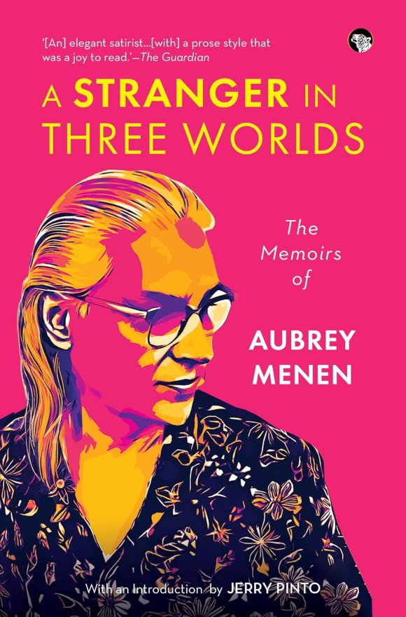
Title: A Stranger in Three Worlds: The Memoirs of Aubrey Menen
Author: Salvator Aubrey Clarence Menen
Publisher: Speaking Tiger Books
Salvator Aubrey Clarence Menen (April 22, 1912 – February 13, 1989) was a British author, novelist, satirist, and theatre critic. Born in London to Irish and Indian parents, he studied at University College, London, before becoming a drama critic and stage director. During World War II, he was in India, organising pro-Allied radio broadcasts and editing film scripts for the Indian government.
After the war, he returned to London and worked in an advertising agency’s film department, but the success of his debut novel, The Prevalence of Witches (1947), led him to write full-time. Menen’s satirical works explore themes of nationalism and the cultural contrast between his Irish-Indian heritage and his British upbringing.
Menen, a remarkably gifted author who frequently goes unnoticed, adeptly delves into the intricate themes of identity, nationality, and the sense of belonging. He does so with his signature blend of irony and profound insight in his two acclaimed autobiographical pieces. A Stranger in Three Worlds: The Memoirs of Aubrey Menenis an exceptional autobiographical account that spans multiple continents. Menen’s writing is noted for its irony, insight, and a nuanced exploration of themes such as belonging and the quest for the self in a multicultural context.
Menen’s life narrative is defined by his experience as an outsider, or a ‘stranger,’ within the three distinct cultures of England, Ireland, and India. This position of being an outsider enables him to keenly observe and critique the social and cultural norms prevalent in each society with remarkable clarity and humor.
The memoir explores the inherent tensions and contradictions that arise from possessing multiple, often conflicting, identities, as well as the difficulties of establishing a coherent sense of self when one does not entirely belong to any particular group.
The book’s narrative style is marked by irony and a keenly humorous outlook on the absurdities of the social conventions and biases he encounters across these cultures. His insights are both deeply personal and widely relatable, resonating with anyone who has navigated the complexities of multicultural or diasporic identity.
The essays featured in Dead Man in the Silver Market, originally published in 1953, analyse themes of jingoism, social class, and the absurdities associated with national pride, intertwining personal stories with sharp social critique.
Written shortly after World War II, his irreverent insights into English society, colonial history, and human nature continue to resonate powerfully in contemporary discourse. ‘The Space within the Heart’, authored in 1970, presents a more personal and philosophical exploration of existence, love, and self-awareness.
Infused with humour and gentle satire, it contemplates the essence of the soul, drawing from the Upanishads and European literary traditions. Menen’s seemingly straightforward yet deeply impactful writing encourages readers to transcend rigid identities and appreciate the fluidity inherent in the human experience.
With an introduction by Jerry Pinto, this omnibus edition functions as a memoir, offering personal reflections and experiences, while simultaneously serving as a critique of imperialism, examining its impacts and consequences.
Furthermore, it thoroughly explores the intricacies of identity, rendering it an exceptional piece of literature that is both informative and captivating, prompting readers to engage in deep reflection on its themes.
.
Bhaskar Parichha is a journalist and author of Cyclones in Odisha: Landfall, Wreckage and Resilience, Unbiased, No Strings Attached: Writings on Odisha and Biju Patnaik – A Political Biography. He lives in Bhubaneswar and writes bilingually. Besides writing for newspapers, he also reviews books on various media platforms.
.
PLEASE NOTE: ARTICLES CAN ONLY BE REPRODUCED IN OTHER SITES WITH DUE ACKNOWLEDGEMENT TO BORDERLESS JOURNAL
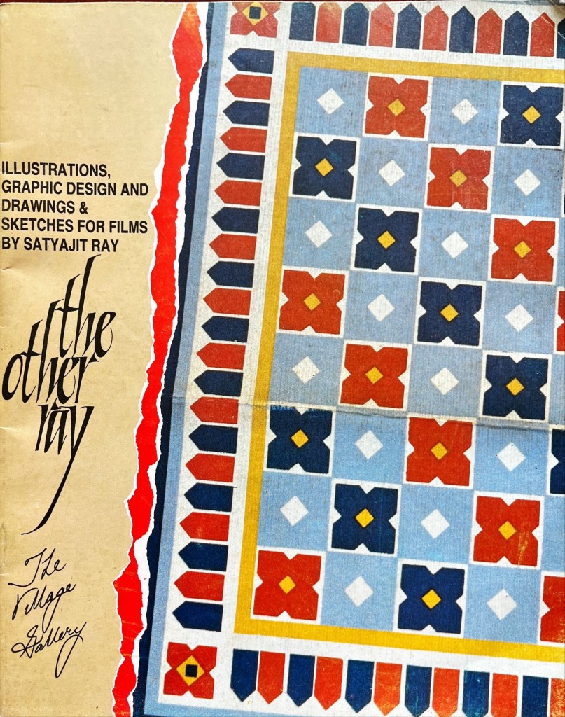
Dolly Narang muses on Satyajit Ray’s world beyond films and shares a note by the maestro and an essay on his art by the eminent artist, Paritosh Sen
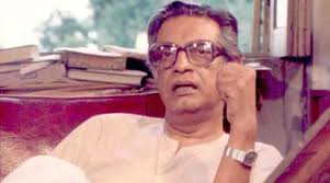
Brochure cover: Provided by Dolly NarangSatyajit Ray(1921-1992): From Public Domain
My trunk call from Delhi to Calcutta booked one day before finally materialised. This was way back in 1990 when trunk calls were the fastest mode of communication. In a coarse voice, the operator demanded a response from the deep, modulated voice on the other end. ‘Satyajit Ray hai[1]?’ she asked, her tone sharp with impatience.
I could hear the legendary filmmaker’s composed response to the operator’s gruff, abrupt tone. I winced at her brusqueness feeling helpless to intervene and apologise.
When she connected me, I introduced myself to Satyajit Ray and ventured to share my idea of an exhibition that would showcase a lesser-known yet equally fascinating facet of his oeuvre—his drawings, film sketches, graphic design and more. A visual archive that, though rarely seen by the public, was as significant as his cinematic legacy. He was initially apprehensive—modest about this body of work and uncertain about how it would be received
This initial conversation was followed by a series of follow-up exchanges over trunk calls, over several months. Each call felt like a step closer to realising the exhibition. I would book trunk calls in the urgent category request for PP (person to person) as they took less time to materialise. PP calls were specifically for the person whose name was specified. Still, patience was essential.
Ray, to my surprise and admiration, always answered the phone himself. No secretary, no assistant screening the calls. The simplicity and humility was endearing.
I had first shared the idea of the exhibition with Paritosh Sen one of India’s master painters and a friend of Ray’s of an exhibition of a lesser known yet fascinating facet of Ray’s genius: children illustrations, detailed film sketches, designs for book and magazine covers, typeface designs, his diverse portfolio of graphic work. Paritoshda, as I affectionately called him who mentored and guided me as I began my journey into the art world, not only approved of the idea but took it upon himself to speak to Ray, whom he knew personally. Following the introduction through Paritoshda, I pursued the idea with the legend.
During the first phone call, I briefly spoke about my concept— an exhibition that would focus on his rarely seen visual art. His immediate response was hesitant and guarded, “These are very small works on paper just a few inches in length and width.” he said. “They would be of no interest.” I ventured that this was a unique and a first time view into his visual legacy and the size would not take away from the impact. He further expressed his doubt about his graphic work having any resonance beyond Bengal, in North India. I further submitted that his artistic genius and versatility has an appeal beyond Bengal. This exhibition would give a rare insight into the work and thought process of not only the deeply respected and admired film maker that we all know but also of Satyajit Ray the illustrator, the graphic designer, along with revealing the meticulous and detailed planning into his films.
I hoped to bring this body of work — into public view for the first time. The idea was to get people to see another Ray — not the filmmaker behind the camera, but the artist behind the pen and brush.
I remember Ray had explained that he had a busy schedule and preoccupied with the editing of Ghare Baire. After several months of trunk calls and waiting, I booked another urgent, person to person call. Finally the breakthrough I was waiting for, “ Come next week,” he said. His doubts of an exhibition having been cleared through the intervention of Paritoshda and somewhat through my persuasion.
As I boarded the Indian Airlines flight to Calcutta the following week, a surge of excitement gripped me. I was given a morning time to meet him at his residence: 1/1 Bishop Lefroy Road. I arrived with some trepidation. Standing outside this tall imposing door, I rang the bell. Soon, I found myself face to face with the master who opened the door himself—his tall, commanding presence matched only by his deep, well-modulated baritone voice greeting me warmly. He led me into his much photographed studio/workplace. He was looking comfortable and relaxed in a white kurta pajama. In contrast to his majestic yet simple presence, I was nervous and hoping it was well masked.
Thereafter, began a series of visits to his flat. Each time the door was opened by the master himself. And I would be led into his study teeming with books lining the teak wood book shelves.
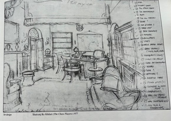
He would sit in a comfortable looking swivel chair with a brown rexine cover, the corners of which were slightly frayed. Opposite him and within a comfortable arms reach was a small work table with jars tightly packed with paint brushes, pen, pencils. Here is where he did his drawings to create his vast and varied visual legacy of set design, costume design, make up instructions, graphic design, children’s illustrations for the monthly children’s magazine, Sandesh, started by his grandfather, He also designed the covers for Sandesh, more books and magazine covers.
Making of the exhibition
Working alongside him to sort through his drawings was an enriching and memorable experience—one that offered rare insight into his creative mind. Each meeting felt like a step closer to the exhibition becoming a reality. I noticed his interest was slowly growing and he was participating in the selection with increasing enthusiasm and a discerning eye. He approved some while some he felt need not be exhibited. Our meetings would stretch till lunch time until he was gently summoned by his wife, Bijoyadi, to take his lunchbreak. He would extend the search and wrapped up a little beyond lunch time. I too was cautious not to overstep limits.
As he began to look in his study, he unearthed these miniature treasures on paper tucked between books or between their pages, resting on tall teakwood bookshelves. Some were found under sofa cushions. He remembered that many were with his cousin Lila Majumdar[2] and that he would have to ask her. As he delved deeper into his collection he remarked, “I had forgotten I have done all this work.”
During few initial meetings, I would address him as Mr. Ray, which was beginning to feel formal and somewhat awkward. So I asked if there was another way I could address him.
“Manik,” he asserted. “Everyone calls me Manik.”
From that moment on, I called him Manikda. These recollections return to me vividly as I write this piece.
We turned our attention to his iconic crimson books, neatly stacked in his study. These well-known volumes are a treasure of Ray’s meticulous preparatory work—filled with detailed sketches for his films, costume and set designs, makeup instructions for his makeup artist, architectural notes, and an astonishing range that gave glimpses into his thought and work process.
Sourced from the brochure provided by Dolly Narang
We did not want to remove any drawings from these precious notebooks. He selected the drawings that he liked and decided he would ask Nemai Ghosh (1934-2020), his close associate and long-time photographer, to photograph them for the exhibition.
Several drawings, having come loose from the notebooks, were used in their original. We did not want to remove any drawings which were firmly in place in these volumes. Ray identified the drawings that appealed to him and Ghosh photographed them.
Part two of the exhibition was titled “Drawings and Sketches For Films’ and it comprised of both originals and the photographs by Nemai Ghosh of the drawings chosen by Ray.
I nudged him further and asked if there was anything else he might suggest from his visual repertoire.
He thought of his film posters. The ones readily available in his flat were posters of Nayak and Ghare Baire, which were loaned for the exhibition. He was particularly eager to include the poster of Devi, but after searching, he discovered he only had one copy and was reluctant to part with it.
Top: Hoarding of Ray’s film Goopy Gyne Bagha Byne (1969). Below:: Film posters of Nayak(Actor, 1966) and Ghore Baire (Home and the World, 1984). Sourced from the brochure provided by Dolly Narang
We tried to include artworks which would represent the different aspects of his visual repertoire. It seemed there was no end — typefaces he had designed, advertising campaign when he worked for D.J.Keymer. While searching he realised he did not have the originals of the typefaces he had designed but fortunately they had been preserved in the photographs taken by Nemai Ghosh. Later Paritoshda told me that he was given an award for the typeface by an American foundry and named it after him, Ray Roman.
Provided by Dolly Narang
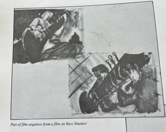
An album was discovered containing a silent film he had conceptualised on paper but never brought to life—a silent film on Ravi Shankar with his music in the background. The album, composed of monochromatic black watercolours, was photographed by Nemaida. It drew great interest, offering a first-ever glimpse into a project that was never realised.
Paritoshda advised that Ray had composed music for many of his films. A tape with his compositions was playing continuously and softly in the background at the exhibition.
The exhibition was presented in two parts each had a duration of three weeks. Part one was devoted to his Graphic design, drawing and part two was about his preparatory sketches for films.
I requested Paritoshda to write an article for the exhibition catalogue, to which he graciously agreed. He penned an insightful essay which was appreciated by Ray himself as well as by fellow artists, critics, and visitors who found his insights both illuminating and deeply engaging. When I asked him for his suggestion for a title for the exhibition, he thoughtfully suggested — “The Other Ray” — a title both fitting and meaningful.
With the socio-political upheavals around us in Delhi, it wasn’t easy—cataloguing, printing invitation cards, framing, arranging transport to distribute the invitations. Invitation cards from our mailing list of over one thousand had to be hand delivered.
I asked Manikda for names of his friends and associates who he would like invitations to be sent to. His list included names both in India and abroad.
About a week before the event, I visited AIFACS[3] to put up a poster for the exhibition. To my surprise and delight, sitting in one of the exhibition halls was none other than M.F.Husain himself. It felt like a godsend—an unexpected opportunity to personally invite him.
He was visibly excited upon hearing about the exhibition and expressed interest in seeing the artworks immediately wherever they were. I explained that the pieces were still at home and would be better appreciated once they were displayed on the gallery walls. But he was insistent—he wanted to see them right away. We got into my car and drove to my house. Husain viewed the works in thoughtful silence moving from work to work, looking at each with great interest. After perusing them keenly he settled at the dining table and began reminiscing about his association with Ray – a moment as historic as it was moving, etched forever in my memory.
I was not prepared with either a tape recorder or a camera to record this memorable encounter. Fortunately, The Illustrated Weekly, under editor Pritish Nandy, later published his reflections in an article spread over two pages with several illustrations of his graphic work.
Opening to the Public
When the exhibition finally opened at The Village Gallery in New Delhi’s quaint Hauz Khas Village it was received with great enthusiasm and acclaimed by both critics and the public
Visitors from all walks of life came to see the “ The Other Ray”. For many, it was a revelation. The same legendary filmmaker who had given the world The Apu Trilogy had also crafted whimsical illustrations for children, designed book jackets, created typefaces. It was exciting for them to get a peek into his creative process as a filmmaker through his detailed film sketches.
I made another trunk call to inform him that the article in the brochure by Paritosh Sen had been chosen for The India Magazine’s cover story. The next day, when I spoke to him again and offered to send him a copy of the magazine, he responded with excitement. He said he couldn’t wait and had already gone to the market to buy a copy for himself.
Once the exhibition—having stirred great excitement in the art world—came to an end, it was finally time to take it down. The last few days were deeply moving. Visitors lingered, often spending long hours in the gallery, reluctant to leave, as if trying to hold on to the experience a little longer. The space was filled with quiet reflection and enriched by heartfelt exchanges.
Looking back, organising this exhibition remains one of the most fulfilling experiences of my life. What I cherish is the memory of the many hours spent in his study carefully selecting the works for the exhibition. It was a collaborative process, he was open to my suggestions yet he became more and more involved as he delved deeper into his graphic work.
An idea, carefully nurtured, took shape as an exhibition. What was especially fulfilling about the exhibition was how it brought to light a lesser-known facet of Ray’s creative genius—his remarkable visual imagination, his penchant for details, his industriousness. Until this exhibition, only a few of his sketches had appeared in articles and books, leaving much of this work largely unseen. The display offered audiences a rare and intimate glimpse into his visual world as well as his work and thought process, making it especially significant.
The final step was to return the works. I personally placed each delicate sheet into thin plastic sleeves, compiled them into a portfolio, and flew to Calcutta to return them to the master. True to his dignified demeanour, he received the compilation with quiet pleasure. He expressed both satisfaction and a hint of surprise at the enthusiastic response the exhibition had received. I took the liberty of asking him if I could keep as a memento two works from each part of the exhibition. He readily agreed and asked me to choose. I selected one black white illustration for Sandesh and credit title from his film Sonar Kella (The Golden Fort, 1974) . One more request — Could he sign these please? To which he graciously agreed.
As I took my leave, I shared a thought—could we perhaps work on a sequel to The Other Ray? He received the idea warmly, but unfortunately, it never came to fruition. He soon became immersed in Agantuk (The Stranger, 1991), and not long after, his health began to decline.
As I write this, memories come rushing back, and I find myself tempted to echo Manikda’s words of my experience that “I had forgotten I had done all this work.”
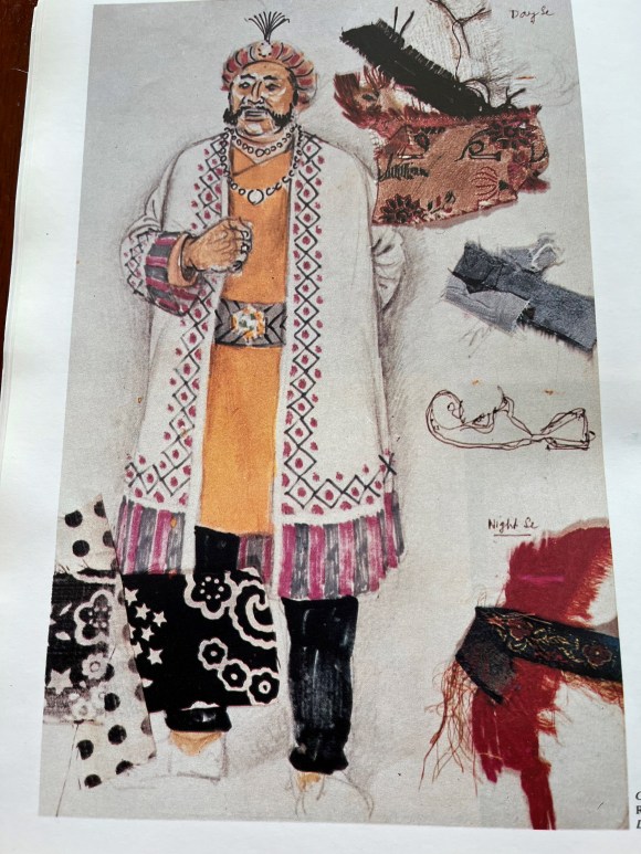
Costume designed and sketched by Ray for Hirak Rajar Deshe (In the Country of the Diamond King, 1980) Sourced from the brochure provided by Dolly Narang
Ray’s Note in the Brochure:
My grandfather was, among other things, a self-taught painter and illustrator of considerable skill and repute, and my father — also never trained as an artist — illustrated his inimitable nonsense rhymes in a way which can only be called inspired. It is, therefore, not surprising that I acquired the knack to draw at an early age.
Although I trained for three years as a student of Kalabhavan in Santiniketan under Nandalal Bose, I never became a painter. Instead, I decided to become a commercial artist and joined an advertising agency in 1943, the year of the great Bengal famine. Not content with only one pursuit, I also became involved in book designing and typography for an enterprising new publishing house.
In time I realised that since an advertising agency was subservient to the demands of its clients, an advertising artist seldom enjoyed complete freedom.
This led me to the profession of filmmaking where, in the 35 years that I’ve been practising it, I have given expression to my ideas in a completely untrammelled fashion.
As is my habit, along with filmmaking, I have indulged in other pursuits which afford me the freedom I hold so dear. Thus, I have been editing a children’s magazine for thirty years, writing stories for it and illustrating them, as well as illustrating stories by other writers.
While preparing a film, I’ve given vent to my graphic propensities by doing sketches for my shooting scripts, designing sets and costumes, and even designing posters for my own films.
Since I consider myself primarily to be a filmmaker and, secondarily, to be a writer of stories for young people, ·I have never taken my graphic work seriously, and I certainly never considered it worthy of being exposed to the public. It is entirely due to the tenacity and persuasiveness of Mrs. Narang that some samples of my graphic work are now being displayed. Needless to say, I’m thankful to Mrs. Narang; but, at the same time, I must insist that I do not make any large claims for them.
Ray’s signature: Sourced from the brochure provided by Dolly Narang
SATYAJIT RAY
The Consummate Artist by Paritosh Sen (1918-2008)
(Republished from the brochure of “The Other Ray” exhibition)
It was the summer of 1945. I was holding my third one-man show and my first in Calcutta. On the third day of the exhibition, Prithwish Neogy (a brilliant scholar, now heading the Department of Asiatic Art at the Honolulu University) entered the exhibition hall accompanied by an extraordinarily tall and swarthy young man. I had known Prithwish earlier. The latter was introduced to me as Satyajit Ray. I was vaguely aware of him as the only son of the late Sukumar Ray, the creator of a unique body of nonsense rhymes and humorous prose remarkable for their originality of vision and an extremely sharp intellect and imaginative power. Satyajit was also known as the grandson of Upendra Kishore Ray, one of the inventors of half-tone block making, a pioneering creator of a sizeable body of children’s literature and the founder of the well-known children’s magazine, Sandesh, and a painter of no mean talent either.
Satyajit was then doing a course in painting in Santiniketan under the very able guidance of Benode Behari Mukherjee, a great artist and an equally great teacher. Besides, Ray had also the unique opportunity of coming in close contact with Nandalal Bose, the guru of both Benode Behari and Ram Kinkar, undoubtedly the foremost sculptor of contemporary India.
Earlier he had also received the blessings and affection of Rabindranath Tagore. Although he did not complete the art course in Santiniketan, the experience of being surrounded by these great artists and the unique rural setting of the Santhal Parganas, as portrayed by these artists and the poet, enabled Ray to appreciate nature in all its diverse and glorious manifestations and opened his eyes to the mysteries of creation. This single unprecedented and cherished experience helped him to formulate his ideas about the visual world and to unlock doors of visual perceptions. Added to this was his study and understanding of the classical and folk art, dance and music of our country. The magnificent collection of books in the Santiniketan library of world art and literature also helped him to widen his horizon. It was here that he read whatever books were available on the art of cinema. The seeds of a future design artist and a filmmaker were simultaneously sown here.
Having lost his father early in life, the need for earning a livelihood assumed enough importance to make him leave Santiniketan prematurely and look for a job in the field of advertising art or, as it is better known in modern parlance, graphic design. A latent talent is bound to make its presence felt sooner or later, whatever be the chosen field. As Tagore said in one of his early verses, “Flowers in bloom may remain hidden by leaves but can they hide their fragrance?” Satyajit Ray was appointed by the then D.J. Keymer (now known, as Clarion Advertising Services Ltd.) as a visualiser-cum-designer, often executing the finished design or an entire campaign himself.
Together with two of his contemporaries, O.C. Ganguli and Annada Munshi, Ray was trying to evolve certain concepts not only in illustrations but also in typography which would give their design an overall Indian look. One recalls those highly distinctive newspaper and magazine ads, the magnificent calendars, posters, cinema slides and what not of the late ’40s and ’50s not without a certain nostalgia. If my memory does not fail, I think some of the works of these three artists were even published in Penrose Annual and elsewhere. Here it may be worthwhile to bear in mind that the style evolved by these three artists made a welcome departure from the dull academicism and the stereotypes being practised by most of the advertising agencies of those times. The freshness and vigour displayed in their approach was readily appreciated both by their employers and their clients. Ray was particularly strong in the difficult area of figure drawing, an area in which many graphic designers were found singularly wanting.
Although he was soon to move away from commercial art to embrace his new-found love of filmmaking, he would continue to remain an illustrator of the first order as would be evident from his emergence as a story-teller in the two popular genres of detective and science fiction. (Not many outside Bengal know that Ray’s literary output is in no way less than that of his cinema and that most of his books have already run into thirty to thirty-five editions). He has not only been illustrating his own stories, but over the years he has been designing the covers of his grandfather’s once defunct children’s magazine Sandesh, revived by him nearly two decades ago, which also carried many illustrations by him. But in my opinion his most cherished field is calligraphy, whether that be of the pen or brush variety.
Illustrations from Sandesh: Sourced from the brochure provided by Dolly Narang
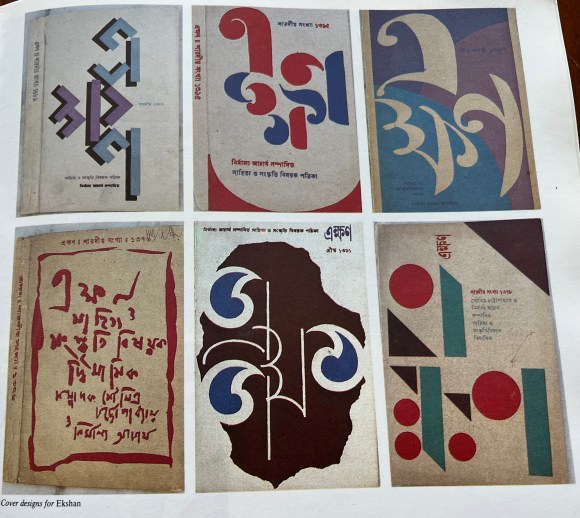
This art he imbibed from his guru Benode Behari Mukherjee. Over the years he had also been studying the art of typography with the scrutinising eye of a highly creative calligrapher. The result has been a series of innovations in both Bengali and English lettering evolved for posters, banners and book covers. These very original works gave a tremendous fillip to graphic design in general and book, magazine and record covers in particular, especially in Bengal. The books Ray designed for the now defunct Signet Press of Calcutta way back in the early ’50s set new trends and were considered as models for book production both in terms of page layout, typography and jacket design, the last being his chosen field where, as I said earlier, his innovations have known no bounds. The covers of the well-known literary magazine Ekshan, which he has been designing for many years, to give only one instance, bear ample testimony to his apparently playful but significant experiments with the forms of three Bengali letters which constitute the name of the magazine. The wide variety of his inventiveness is one of his great achievements in the field of cover design.
Cover designs for Ekshan. Sourced from the brochure provided by Dolly Narang
Then there are the posters, banners and slides he designed for his own films. These too were eye openers and instant trend setters. Who can ever forget the huge banners and billboards of the Apu trilogy put up at important street junctions of Calcutta! Their freshness of ideas, design concepts and calligraphy were not to be missed even by men and women in the street. Simultaneously with his creative outburst in the art of cinema, his creativity in graphic design reached new heights. What was remarkable was the fact that Ray imminently succeeded in investing all these works with a highly distinctive Indian flavour derived from his awareness of our folk traditions (especially 19th century Bengali book illustrations and woodcut prints of decorative lettering) both in their linear vigour and simplicity as well as in ornamentation.
One of the most outstanding examples of this approach was the publicity material he designed for Devi. The underlying theme of the title expresses itself forcefully both in the highly imaginative design of the lettering and the image. Their fusion is perfect. Not many graphic designers have been as type conscious as Ray. He personifies the printing designer’s gospel “type can talk”. That a letter or a printing type is not only a sign but an image by itself, and if appropriately employed can have immense communicative power and is capable of expressing a whole range of human emotions was known to Ray from the very beginning of his career.
In the enormous range of Roman printing types there are many in the humanist tradition in their simple aesthetic charm, warmth of feeling as well as in their highly elegant but delicate anatomical details. There are also those which are severe, powerful and cold but nonetheless are highly attractive in their own ways.
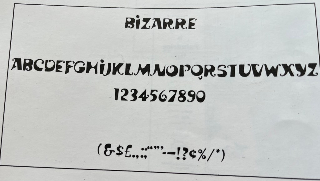
It is often overlooked by most readers that a letter’s structure and anatomy can be reminiscent of things in the visible world, both natural and man-made. Some can have the gentle rhythm of the rise and fall of a female form, others may have the majestic look of a well-designed edifice-just to give only two similes. Ray not only bore all these considerations in mind but used his calligraphic knowledge, skill and innovative power to their full advantage when he designed the three printing types called Ray Roman, Daphnis and Bizarre for an American type foundry nearly two decades ago.
Sourced from the brochure provided by Dolly Narang
Not many of us know the infinite patience, rigours, discipline and the endless process of trial and error involved in designing a whole series of a printing type. That, in spite of his other demanding preoccupations, he found enough time to design three complete sets of types bears ample proof of his diligence and perseverance and his passionate love for the world of types. Those of us who have known him over the past decades are profoundly admiring of the fact that he is a workaholic in the best sense of the term. His diverse creative output is staggering and would put many a man half his age to shame.
In the ’40s, I met Satyajit periodically as I worked as an art master in Indore. One of the high points of my visits to Calcutta during the long summer or the short winter holidays was to frequent his ground-floor apartment in South Calcutta. It was at his place I first listened to TS Eliot’s recital in the poet’s own voice of TheWaste Land which was just brought out by HMV (now known as EMI). It was on such visits I would also have an opportunity to listen to his latest collection of records of European classical music. And it was also on one of such occasions I first heard him toying with the idea of making a film based on Rabindranath Tagore’s novel, Home and the World, a project which was abandoned soon after and was finally realised nearly four decades later.
It was not before1 returned home in 1954 after a five years’ stint in Paris that I came to know of his intense involvement with the making of Pather Panchali[4]. I vividly remember to this day the excitement with which he described it to me and invited me to a screening of the rushes. He brought out all the sketches and doodles he made along with side notes in Bengali not only of the dress, props and characters in the script but also very quick but masterly sketches of frames of each of the sequences, camera movements, etc. I remember asking him why he thought it necessary to make such careful preparations before shooting. To which his quick but significant reply, “One of the foremost but very difficult things in filmmaking is to determine the placement of the camera.” He was equally quick to point out that this is only the first part of shooting a movie and not stills.
Those of us who watched him in action know only too well that although there is always a professional cameraman present in his unit, in reality he becomes the cameraman himself. The visual richness of a film is as important to him as a story well told — the one being inseparable from the other. This is the most distinctive feature of his artistic achievements in all his films.
Ray is a lyricist of the highest order. From his first film Pather Panchali to his latest ShakhaPrashakha[5], this lyrical bend binds all his films together in the form of an oeuvre and finds full fruition in his most recent work.
Some of the imperceptibly slow camera movements in this film are sheer poetry. Although not yet released, I had the opportunity of seeing it twice, and apart from anything else, I as a painter was bowled over by its visual richness and its consummate technical finesse. I have reasons to say this. Whenever I see a movie, I try to see it through the lens of the camera and having witnessed many film shootings of some of Ray’s films, it has become a habit with me to follow the movements with great fascination. Thus, it helps me greatly to enjoy watching a film from the aesthetic and technical viewpoint.
I am sure that in order to achieve maximum artistic quality Ray finds the preliminary exercises made primarily in pen and ink very useful. These small and simple sketches, evidently done in quick succession, have all the spontaneity and vigour of something impeccably visualised and bear the unmistakable stamp of a born lyricist. Their linear treatment, unorthodox positioning on paper and an apparent insouciance, at any rate, in my eyes, are the products of a highly creative mind and are designed to meet the needs of a fastidious aesthete.
Among the sketches, one comes across portraits of many of the characters in his films in various moods and postures. These could easily be rated as some of his best works in this group. Only someone with consummate skill can bring out the full characterisation in a postage-stamp format with utmost economy and clarity. The lines which define the contours and other details of the figures are free flowing, sure and firm, the result of years of practice both with the pen and the brush.
One of the most interesting exhibits in the present collection is the album containing one of his earliest essays in visualisation of a film project — the documentary he once wanted to make on Ravi Shankar playing the sitar and on the tabla accompaniment. Ray showed it to me as early as 1954. It is possible that the inspiration came from his viewing Uday Shankar’s ballet film, Kalpana (Imagination) -– a film which he studied frame by frame by taking scores of stills in the dark theatre where the film was released. He showed me the entire series one by one and pointed out among other things the unusual camera angles, the dramatic lighting, the magic of black and white, especially in the close-ups of both the dancers and the tabla playing. Although the Ravi Shankar film was never released, I think Ray thoroughly enjoyed the exercise and learnt a lot from it.
Sourced from the brochure provided by Dolly Narang
This, along with numerous sketches and doodles related to his films, will ever be regarded as something unique in the history of filmmaking in our country.’ Only a few’ and they can be counted on one’s fingers, in world cinema have been such gifted artists too like Eisenstein, Kurosawa, Fellini and a few others. The Village Gallery should be congratulated for presenting to us “The Other Ray – the Consummate Artist.”
Dolly Narang, a gallerist, has conceptualised innovative pathbreaking exhibitions. A recent student of sculpture, she has the satisfaction of experiencing both personal and spiritual evolution as a Pranic healer and as a grandmother.
.
PLEASE NOTE: ARTICLES CAN ONLY BE REPRODUCED IN OTHER SITES WITH DUE ACKNOWLEDGEMENT TO BORDERLESS JOURNAL
The moment the calendar flips to January, Jakarta undergoes a transformation, almost as if it’s washed anew, like one’s gazing at the city through rose-coloured glasses. Although Chinese New Year normally falls in February, the city wastes no time in dressing itself at its festive best, akin to a newly wed bride right from the beginnings of the year itself. The streets glow with the soft, warm hues of red lanterns swaying gently in the tropical breeze, intricate golden motifs adorning shop windows shaped in Chinese characters signifying good health and luck, ah! and of course the unmistakable notes of celebratory music drifting through the air. For a few short weeks, Jakarta doesn’t just celebrate Chinese New Year—it embodies it.
Growing up in Jakarta, yet hailing from Indian descent, I was always fascinated by how this festival seemed to take over the city, outshining even the likes of Christmas in its grandeur. To an outsider, Jakarta in February might feel more like Shanghai at its prime than the capital of the world’s largest Muslim-majority country, however the fabric of Chinese New Year is woven into the hearts of people across the country.
Photos provided by Eshana Sarah Singh
Jakarta’s shopping malls—already known for their extravagance and avant-garde ambiance —take it up a notch during this season, pull the notch all the way up really. Grand Indonesia, Pacific Place, and Central Park become galleries down the streets of metropolitan Beijing, displays of Chinese artistry adorn the walls, with colossal dragon sculptures wrapping around pillars, cherry blossom trees dotting atriums, and enormous red envelopes symbolising prosperity displayed in elaborate installations. At Pantai Indah Kapuk, a neighbourhood known for its Chinese-Indonesian roots, the neighbourhood where I grew up, restaurants overflow with families indulging in yu sheng (a prosperity toss salad) and steaming platters of shumai (dumplings) wafting their aromas into the air.
Photo provided by Eshana Sarah Singh
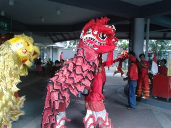
In Jakarta’s very own Chinatown, Glodok, the roads are chock-filled with movement, cacophonous and chaotic but so vibrant. Red flags with auspicious messages printed in gold are hawked by vendors, temple incense wafts by getting ever-stronger with murmurs of chanted prayers for prosperity and riches along the roads.
The sound of drums boom so loud that the ribs vibrate, that the very ground trembles beneath one’s feet, proclaiming the onset of the Barong Sai—an ancient lion dance with movements so fluid and gracious that they can’t help but draw eyes passing by. Their beauty, yet further enhanced by the resonant clashing of cymbals, is in theory supposed to ward off evil spirits and usher in prosperity; this tradition infact predates the existence of most civilizations.
Lion Dance. Photo provided by Eshana Sarah Singh
Amidst all this festivity, I am reminded of the countless Chinese New Year’s I’ve spent in school growing up and lessons from my Mandarin teacher, whom we affectionately called Laoshi or teacher.
Tha author and her Chinese teacher. Photo provided by Eshana Sarah Singh
“Laoshi, I remember you used to tell us about all the dos and don’ts of Chinese New Year,” I chuckled, eager to hear her insights once again.
She chuckled. “Ah, yes! There are many, and each family follows different ones, some only specific to them. But some are universal. For example, never sweep the floor on the first day!”
I laughed, “Why is that again?”
“Because you will sweep away all the good luck for the year of course! The same goes for washing your hair—avoid it, or you will wash away your fortune. And of course, you should wear red. It brings happiness and wards off the Nian monster.” It seemed a lot of the superstitions absurdly revolved around washing, but then again they’re superstitions so perhaps logical reasoning wasn’t the best path forward.
“What about food? Are there any specific dishes that must be eaten?” I asked.
“There are actually, eating fish is a must because the word for fish in Mandarin sounds like ‘surplus,’ which is meant to bring in abundance for the coming year. And you can’t forget about tangerines as well, have you ever noticed how they’re only ever sold during the Chinese New Year? Their name sounds like ‘luck’ in Mandarin, so people always exchange them with family and friends. I think by now you can guess why,” Laoshi chuckled.
She paused slightly, her voice wavering and tone turning nostalgic. “You know, in Indonesia, many Chinese-Indonesian families have developed their own unique traditions, which are understandable; traditions are never truly the same in a place that’s not their own. But this way at least there’s something for everyone. For example, we still hand out angpao, the red envelopes filled with money, but nowadays, some people send them digitally! Would you believe it?”
Wading through the bustling streets of Jakarta in the days leading up to the New Year, the tension, the excitement, the wait was palpable in the air. I noticed how the celebration was not confined to Chinese-Indonesian families alone, it was a time for all of us. Malls showcased extravagant public performances, offices hosted small celebrations, every building was decked out in red from head to toe and even my non-Chinese friends, including me of course, joined in by donning red and sharing greetings of “Xin Nian Kuai Le1.”
Indonesia’s long history with its Chinese diaspora has not always been smooth or friendly for that matter, but in these moments of collective celebration, one realised how some moments were made better when shared with everyone. Chinese New Year in Jakarta is not just a cultural event—it is a national one really.
As traditions evolve, so does the way Jakarta celebrates. Some things remain timeless, temple visits, family reunions, and Barong Sai performances, however that does not mean new customs are not emerging. Metropolitan city dwellers now send digital angpao via apps, families opt for lavish dinners at high-end restaurants instead of a table chock full of home-cooked feasts, and social media becomes a hub for sharing well-wishes and festive experiences, because the wishes of luck and prosperity transcend the miles that separate us. Taking in the sea of red around me, the rhythmic drumbeats, and the air filled with the scent of incense and festive feasts, the very grandeur of Chinese New Year in Jakarta, I know that no matter where life takes me, this festival in this city will always feel like home.
Eshana Sarah Singh is a media and journalism student with a passion for storytelling, blending authentic personal experiences with rose coloured lenses to ultimately explore diverse and untold narratives that chart off the beaten path.
.
PLEASE NOTE: ARTICLES CAN ONLY BE REPRODUCED IN OTHER SITES WITH DUE ACKNOWLEDGEMENT TO BORDERLESS JOURNAL.
India is perhaps the one country where the Jews have maintained their identity without ever being exposed to antisemitism at the hands of their host. Although representing a microscopic segment of the Indian population, the Bene Israel is one of the largest and oldest of the three major Jewish communities of India, the other two being the Cochin Jews of the Malabar Coast and the Baghdadi Jews of Bombay and Calcutta. The Bene Israels arrived at the Konkan coast, shipwrecked, and have lived in India for more than 2,000 years and claim descent from the ten lost tribes of Israel. After they had settled down permanently in the Konkan villages of Western Maharashtra, the Bene Israels were called ‘Shaniwar Telis’ or Saturday oil pressers – a relatively low-caste designation – by the local population because they refrained from working on Saturday, the Jewish Sabbath. Later, they also farmed their land, peddled produce, and took up petty jobs, with the majority working as clerks in government offices and private firms. With time, they adopted Hindu names similar to their Biblical names and took up Marathi surnames such as Rohekar, Penkar, Palkar, and Ashtamkar by adding the suffix ‘-kar’ to the villages and town they came from. They adopted Marathi, the local language, as their mother tongue, and to outsiders, became physically indistinguishable from the local population. But within the village society, the Bene Israels were clearly differentiated from others because they adhered to Judaism. Initially overtones of a caste system coloured the Bene Israelis but they changed with time. Intermarriages between other Jewish communities became common.
With the formation of the nation-state of Israel in 1948, the exodus of the Jews of India took place on a very large scale, and only a few hundred members were left in Gujarat. Initially the integration of the Bene Israels into Israeli society was not easy and many of them returned to India but re-emigrated to Israel later after 1964 when their religious status was finally accepted.
Miss Samuel: A Jewish Indian Saga is written by Sheela Rohekar, a Bene Israel Jew, who is probably the sole-living Jewish Hindi author, and she managed to recreate the distinct identity of her own community. Bearing across life histories of her ancestors, she seeks answers to those questions that troubled her in the novel. Originally written in Hindi, it is aptly translated into English for the first time by Madhu Singh, a professor of English teaching at the University of Lucknow. The novel is narrated by Miss Seema Samuel, an almost 70-year-old Bene Israel living at an old age home called Parisar on the outskirts of Pune, and it portrays her unsuccessful struggle to fit into a majoritarian Hindu society along with the plight of being an unmarried woman in India. She tells the story of her community, of their trials and tribulations, love and loss, and their longing for ‘Aliyah’ — the return to the Promised Land of Israel. Shifting from the Konkani shores to the bustling streets of Ahmedabad (called Amdavad in the local parlance), and finally to the tranquility of an old-age home, each generation of Seema’s family grapples with the tension between their Jewish faith and Indian identity, struggling with their fear of persecution on the one hand and a yearning for acceptance on the other.
In the novel, apart from giving a macrocosmic view of the Bene Israel community which makes its members victims of isolation and alienation from mainstream Indians, and depicting their ancient history and present status, Sheela Rohekar also very deftly presents the microcosmic view of the extended family of her community along with the problems of cross-cultural liaisons and the problems each individual member of her family faces. She states: “But some images embed themselves in the mind, not in the eyes, and chase you – all your life. The role of time in fusing images is not much but the trick of a fading memory. They light up in a flash!”
Since her narration spans six generations and moves deftly backwards and forwards in time, in some places it becomes difficult for the readers to keep track of who’s who in the narrative and occasionally one must go back to the family tree chart at the beginning to place the characters in their proper perspective.
Miss Seema tells the story of Isaji Eloji, who, having married a Hindu woman named Narayani, is believed to have ‘blackened’ the Jewish name. Two generations later, burdened by his grandfather’s transgression, David Reuben stops at nothing to keep his Jewish identity pure, even poisoning his daughter Lily for loving a non-Jewish man.
Again, years later, his son Samuel David (Miss Seema’s father) finds that his Jewish identity makes him an outsider in his own country; and his grandson, Bobby, faces persecution of the worst kind – when he is murdered by a mob in Ahmedabad. It is through reading the loose notes and a long essay that Bobby had left behind that Seema manages to tell us the background history of their community. With his collection of yellow, crumbling newspaper cuttings about the Jews, old coins, badges, awards, certificates, degrees, and moth-eaten black and white photographs that were around 150 years old, Bobby tried to illuminate the path taken by the fellow members of his community – the Bene Israel, the pardesi, the foreigners – whom the people of Amdavad did not know in the twentieth century and believed to be Maharashtrians or converted Christians. The story of how his brother, David, and his Hindu wife. Jyotsna Prajapati, managed to throw Seema out of their apartment in Gitanjali Society also reminds us about such machinations that prevail in our Indian society in general. Through the different tales, the narrator remains a constant, and her memories commingling the past with the present are deftly handled by the novelist.
Further, Miss Samuel becomes a key novel to understand not only for its Indian-Jewish identity but also its multicultural Indian identity and its challenges in the present time. The old age home, Parisar, is not at all a closed space and it opens to new forms of solidarity among elderly abandoned women who, though belonging to different faiths and identities, abandon their frustration with the twists of patriarchal society to discover the meaning of friendship, love and solidarity.
Seema writes: “The campus where I live is surrounded by hills. There is silence, always. I can see residents of my age, some even older, shuffle from one room to another. Constructed at a distance of two hours from Pune, all stories seem to end up here, in this building.” Parisar is thus a model of a tolerant society that not only accepts differences but even respects, maintains and transcends them at the same time. The translation is lucid, and the translator labels her endeavour as ‘interpretive performance’ and a journey beyond imaginary borders. A good read indeed.
.
Somdatta Mandal, critic and translator, is a former Professor of English at Visva-Bharati, Santiniketan, India.
.
PLEASE NOTE: ARTICLES CAN ONLY BE REPRODUCED IN OTHER SITES WITH DUE ACKNOWLEDGEMENT TO BORDERLESS JOURNAL
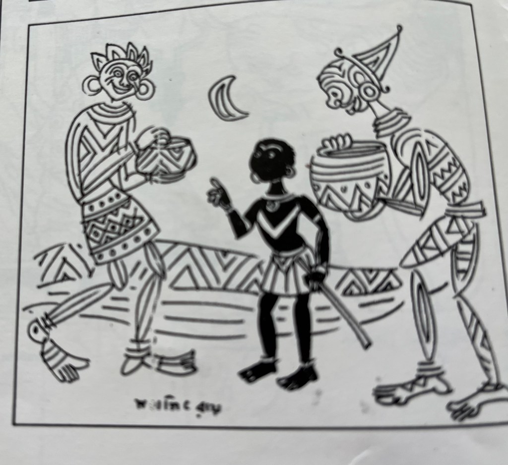
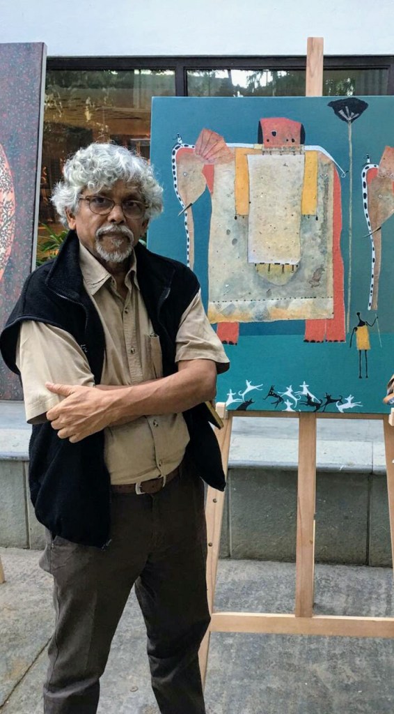
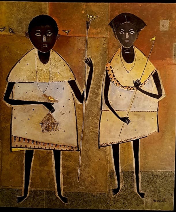
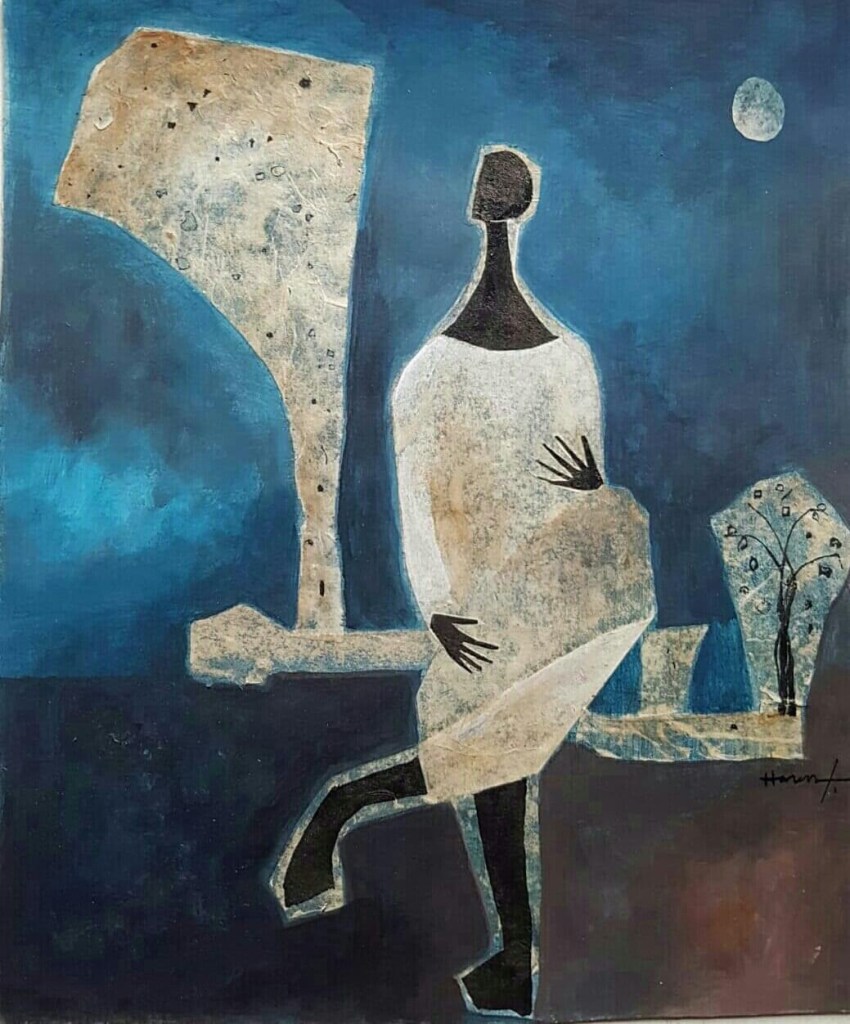
For 50 years now Ratnottama Sengupta has seen Haren Thakur adroitly create art from the humdrum of tribal life. And his stylised abstract of the dark-toned humans still makes her sit up and take note.
Haren Thakur with his painting. Photo provided by Ratnottama Sengupta
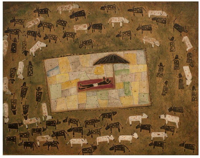
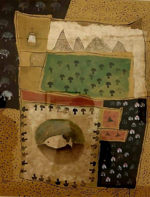
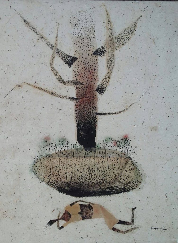
A dark, stick-like outline encompasses a human of the male species. A triangle, an oblong, a rectangle. A white patch in the midst of a sepia-green landscape. A drummer. A mother with a child holding aloft a balloon. Two women bathing in a primitive pond. A quizzical duck. A wriggling worm. Trees hills fish pigs cows fox… And, yes! A train zigzagging its way through a vast expanse of meadows. As we view the watercolours of Haren Thakur from Ranchi, you might think of the rice-white art of the Warli tribals characterised by geometric shapes that depict the rituals of everyday life. I might be inclined to revisit the painted layers on the 100,000-year laterite at the prehistoric rock shelters of Bhimbetka in the foothills of the Vindhyas in Madhya Pradesh. Another viewer might think of the ancient Sauras and the adornment of their walls in their adobe huts in Odisha. The artist himself might have recollections of the animated Santhal pats he saw being created during his student years in Tagore’s Santiniketan. However, none of Haren’s figures are simplistic. They are all stylised. And so adroitly that you are bound to sit up and take note of them no matter how many times you have come across the theme.
Art by Haren Thakur. Photos provided by Ratnottama Sengupta
Form and content come seamlessly together in the paintings that Haren Thakur will exhibit in Delhi’s Habitat Centre from April 15. The artist who mastered Art at Santiniketan — home to Santhals, the native dwellers of Bengal and Odisha — then made his living in Jharkhand, which is home to 32 tribes… Indeed, from his very beginning, the beauty in the dark skin-tone of the men and women going about their chores was the most natural rhythm of life in the bazaars and streets of Bankura Bishnupur, where his family hailed from, or in Purulia, where his father made his home.
Beyond doubt, Rabindranath’s deep affection for the Santhals and the Bauls reinforced this love. Much like Gurudev, Haren finds poetry in their tilling of the earth. In their mono-toned songs and the repetitive steps of their dance. In the fulfilment they find in the primeval life and archetypal love. And when, following in the footsteps of the Universal Poet, Haren finds beauty in a grain of sand, the everyday life ceases to be an essay in deprivation and rises to the level of art.
*
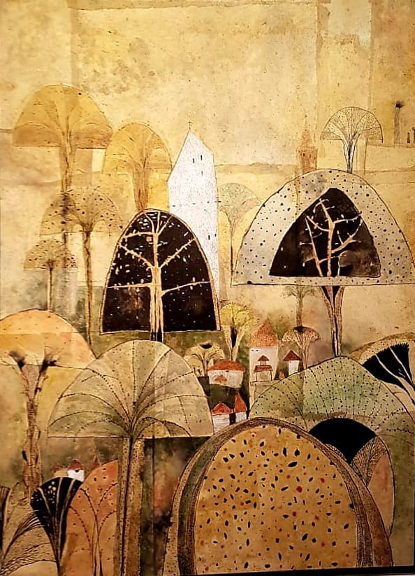
And his colour palette? That too came off the walls of his hostel in Santiniketan, from the frescoes and murals by Binode Behari Mukherjee. From the brick-toned ‘canvas’ that is the prehistoric rock painting of Bhimbetka. The pigment on Haren’s brush and tubes is never loud then, never grating. It is always muted, always mellow. And the impact is heightened by Haren’s utilisation of rice paper, and Chinese ink, on watercolour.
The Nepali rice paper became his signature in 1974. Prior to that he would work the rice paper in the tempera process that was ‘Master Moshai’ Nandalal Bose’s gharana, school – or Indian shaili, style. But in that process of painting layer by layer, the rice paper would lose its original character and serve merely as a background surface.
Then, in his fourth year, for a scholarship test of the Visva Bharati University, Haren experimented by soaking the rice paper in water. It became so pliant that he could spread it out like a piece of cloth. “And its texture!” It won him the scholarship — and immense appreciation from his teachers, Dinkar Kaushik and Somnath Hore. “They said, ‘Go ahead and explore this medium and this process further. It adds a dimension that has immense possibility.”
Art by Haren Thakur. Photos provided by Ratnottama Sengupta
Fifty years have gone by since, but Haren has not given it up. Sometimes, when painting on canvas, he does apply acrylic directly on its surface. But at times, even here, he pastes rice paper on the canvas, primes it with watercolour, then inks in the forms. However he adds, “when I paint on rice paper mounted on board, I do not – cannot – use acrylic. It simply doesn’t have the capacity to be absorbed by the rice paper the way watercolour gets absorbed.” So, in such cases Haren uses transparent watercolour.
Clearly the chemistry between rice paper and watercolour is amazing. Unique.
*
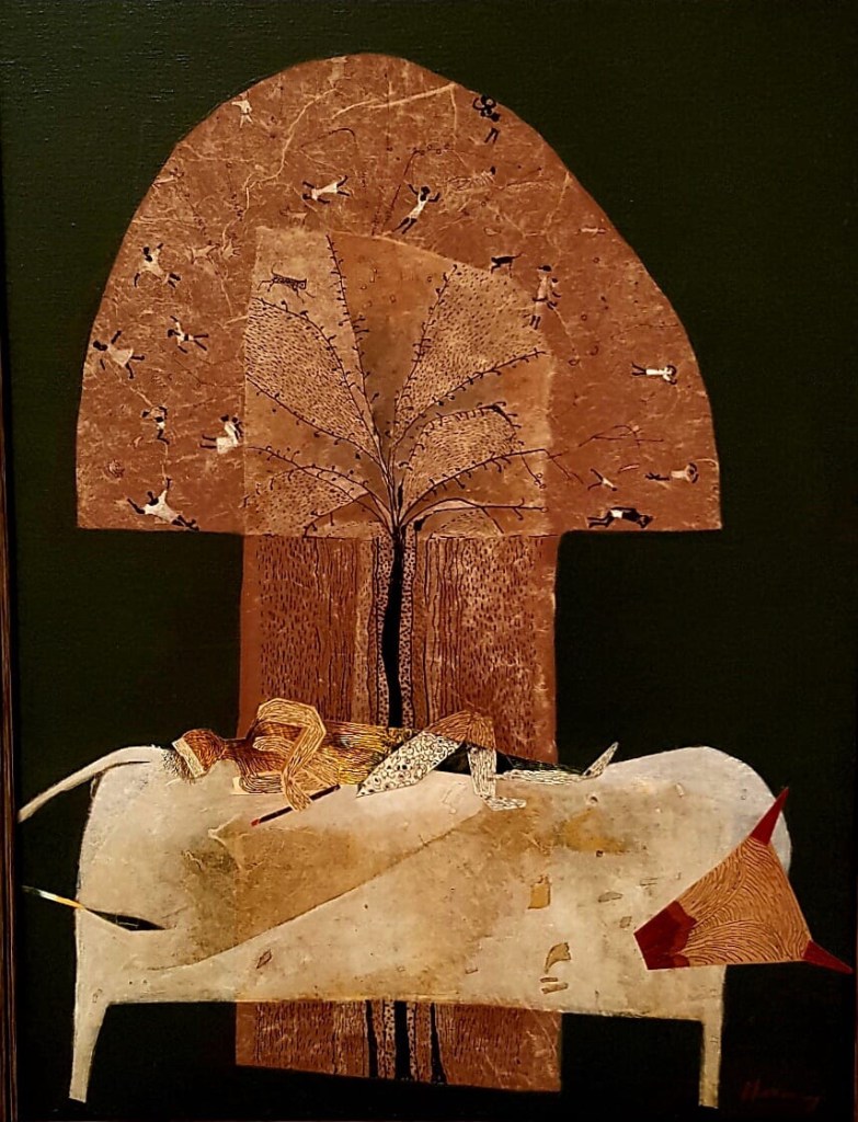
Circling back to the content: Haren’s understated pitch was reinforced by the Zen worldview of a teacher like Somnath Hore. The master minimalist’s use of the white, barely scratched by the red of a wound, spoke volumes — and it made Haren introspect. Once, while exhibiting the Wound series, Somnath Da had said, “I discovered such depth of emotion in the reticence of tones!” This soliloquy got deeply etched in Haren’s unconscious. And eventually it came to express itself in the rusty red of the iron oxide rich Birbhum soil; the roasted brown of Purulia’s rocky earth; the weathered green of the Bauls; the soothing blue of the open sky high above the woolly white of floating clouds.
Art by Haren Thakur. Photos provided by Ratnottama Sengupta
Flattened figures. Non-realistic features. Do you see a hint of Husain – or perhaps Paul Klee – in the abstraction of the human world? I notice a reflection of the figures encountered on Egyptian papyrus. Or the African world. Haren, on his part, reiterates his original inclination: the attraction towards the lack of artifice in Adivasi life. How else would the tribals go about their daily humdrum with a baby knotted to their back? Or float in an open pool under the sun-kissed sky? To the city-bred mind, this would be unthinkable — until Haren captions it ‘Nature’s Bathtub’!
But, notwithstanding my references, the art traditions of the indigenous people over the world have never influenced Haren. “Their art tradition is so rooted in their environment – be it of Jharkhand or of any other.” Even their pigments, brush, and surface are integral to their life. But he certainly derives inspiration from the lifestyle of the original inhabitants, he affirms.
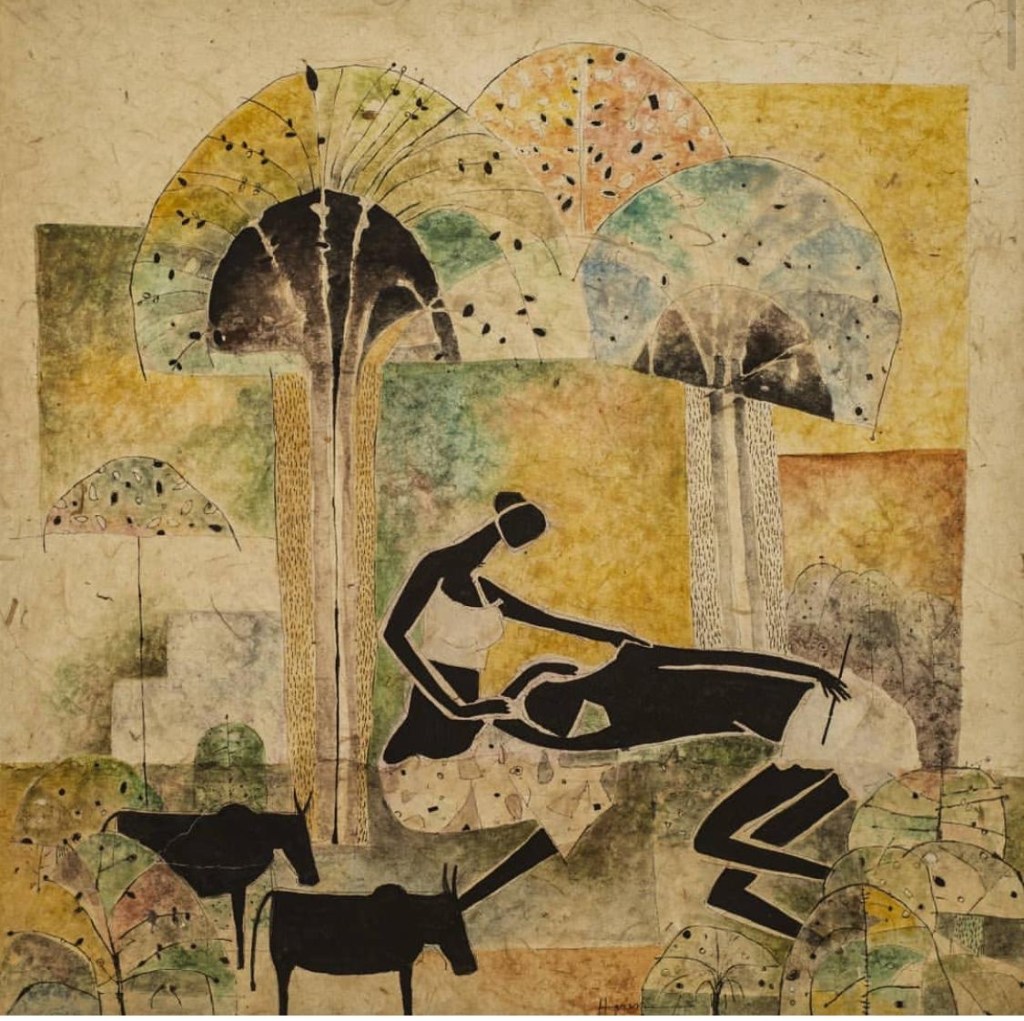
“I have always admired their direct application, the spontaneity of their form,” Haren further explains. “But I am influenced rather by the uncomplicated lives they lead. Since I was in Santiniketan I have admired the way they connect with nature in everything they do. Their intimacy with animals is incredible – they seem to be in dialogue with the animals they domesticate! This became a part of my visual world, especially when I came to live in Ranchi. The same reality imbues the lives of the natives – Oraon, Munda, Ho, Sabar, Bedia, Lohar… They rest under the tree unconcerned about how the ‘civilised’ world looks at them. They speak with the hills, with clouds in the sky, with cattle and kids, trees and waters, rivers and streams!”
Art by Haren Thakur. Photos provided by Ratnottama Sengupta
This they do with no inhibition. Because this routine is a reality they have inherited from their ancients. “That is why I believe there is nothing more ‘Contemporary’ than this,” Haren asserts. This innate natural life, and the Santiniketan grooming, combined to forge his vocabulary, his visual language.
So, in the exhibits, you encounter an abundance of water bodies. Pools and ponds. Rivers and waterfalls. Lotus and lily. Big fish. Many small fish in its tummy. Ducks and kingfishers. Hyacinth and hayfield. All this is a natural part of the countryside that has made Haren theirs.
Interestingly there is also this play with size. In one of the frames an elephant walks down the road – and at every footfall he is greeted by a number of… ants?! Look closely and you will decipher that they are dogs!
Haren is giving you a worm’s eye view. And, in addition to the proportion, he is picturing the Hindi proverb Haathi chaley bazar, kutta bhaukey hazaar/ when an elephant walks to the market, a thousand dogs will bark! Political comment? You said it!
Stay tuned to the song of the Adivasi earth, Haren.
.
Ratnottama Sengupta, formerly Arts Editor of The Times of India, teaches mass communication and film appreciation, curates film festivals and art exhibitions, and translates and writes books. She has been a member of CBFC, served on the National Film Awards jury and has herself won a National Award.
.
PLEASE NOTE: ARTICLES CAN ONLY BE REPRODUCED IN OTHER SITES WITH DUE ACKNOWLEDGEMENT TO BORDERLESS JOURNAL