Dolly Narang muses on Satyajit Ray’s world beyond films and shares a note by the maestro and an essay on his art by the eminent artist, Paritosh Sen
My trunk call from Delhi to Calcutta booked one day before finally materialised. This was way back in 1990 when trunk calls were the fastest mode of communication. In a coarse voice, the operator demanded a response from the deep, modulated voice on the other end. ‘Satyajit Ray hai[1]?’ she asked, her tone sharp with impatience.
I could hear the legendary filmmaker’s composed response to the operator’s gruff, abrupt tone. I winced at her brusqueness feeling helpless to intervene and apologise.
When she connected me, I introduced myself to Satyajit Ray and ventured to share my idea of an exhibition that would showcase a lesser-known yet equally fascinating facet of his oeuvre—his drawings, film sketches, graphic design and more. A visual archive that, though rarely seen by the public, was as significant as his cinematic legacy. He was initially apprehensive—modest about this body of work and uncertain about how it would be received
This initial conversation was followed by a series of follow-up exchanges over trunk calls, over several months. Each call felt like a step closer to realising the exhibition. I would book trunk calls in the urgent category request for PP (person to person) as they took less time to materialise. PP calls were specifically for the person whose name was specified. Still, patience was essential.
Ray, to my surprise and admiration, always answered the phone himself. No secretary, no assistant screening the calls. The simplicity and humility was endearing.
I had first shared the idea of the exhibition with Paritosh Sen one of India’s master painters and a friend of Ray’s of an exhibition of a lesser known yet fascinating facet of Ray’s genius: children illustrations, detailed film sketches, designs for book and magazine covers, typeface designs, his diverse portfolio of graphic work. Paritoshda, as I affectionately called him who mentored and guided me as I began my journey into the art world, not only approved of the idea but took it upon himself to speak to Ray, whom he knew personally. Following the introduction through Paritoshda, I pursued the idea with the legend.
During the first phone call, I briefly spoke about my concept— an exhibition that would focus on his rarely seen visual art. His immediate response was hesitant and guarded, “These are very small works on paper just a few inches in length and width.” he said. “They would be of no interest.” I ventured that this was a unique and a first time view into his visual legacy and the size would not take away from the impact. He further expressed his doubt about his graphic work having any resonance beyond Bengal, in North India. I further submitted that his artistic genius and versatility has an appeal beyond Bengal. This exhibition would give a rare insight into the work and thought process of not only the deeply respected and admired film maker that we all know but also of Satyajit Ray the illustrator, the graphic designer, along with revealing the meticulous and detailed planning into his films.
I hoped to bring this body of work — into public view for the first time. The idea was to get people to see another Ray — not the filmmaker behind the camera, but the artist behind the pen and brush.
I remember Ray had explained that he had a busy schedule and preoccupied with the editing of Ghare Baire. After several months of trunk calls and waiting, I booked another urgent, person to person call. Finally the breakthrough I was waiting for, “ Come next week,” he said. His doubts of an exhibition having been cleared through the intervention of Paritoshda and somewhat through my persuasion.
As I boarded the Indian Airlines flight to Calcutta the following week, a surge of excitement gripped me. I was given a morning time to meet him at his residence: 1/1 Bishop Lefroy Road. I arrived with some trepidation. Standing outside this tall imposing door, I rang the bell. Soon, I found myself face to face with the master who opened the door himself—his tall, commanding presence matched only by his deep, well-modulated baritone voice greeting me warmly. He led me into his much photographed studio/workplace. He was looking comfortable and relaxed in a white kurta pajama. In contrast to his majestic yet simple presence, I was nervous and hoping it was well masked.
Thereafter, began a series of visits to his flat. Each time the door was opened by the master himself. And I would be led into his study teeming with books lining the teak wood book shelves.
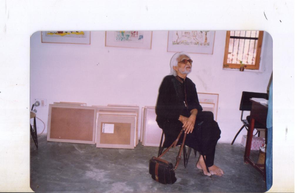
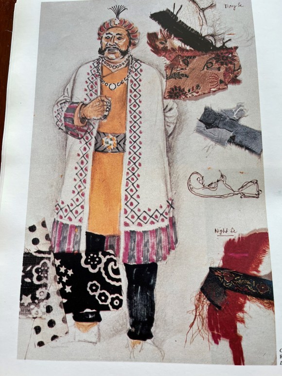
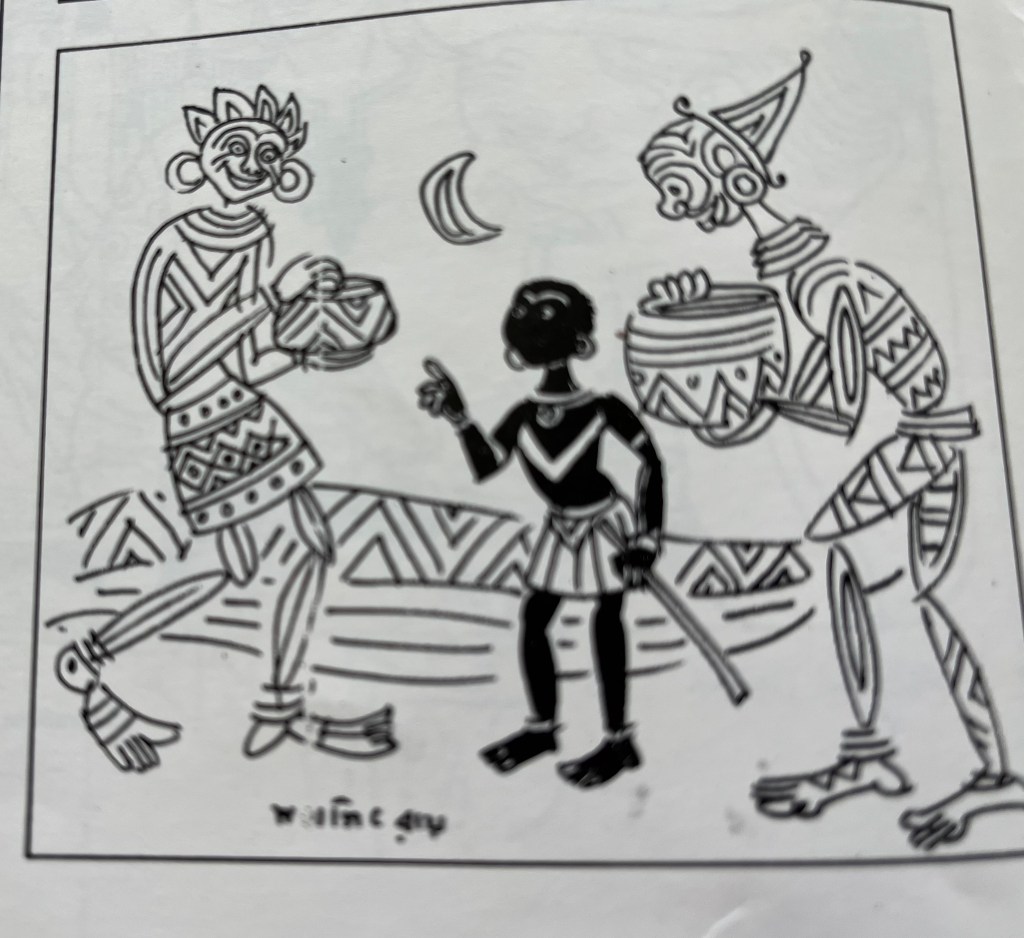
He would sit in a comfortable looking swivel chair with a brown rexine cover, the corners of which were slightly frayed. Opposite him and within a comfortable arms reach was a small work table with jars tightly packed with paint brushes, pen, pencils. Here is where he did his drawings to create his vast and varied visual legacy of set design, costume design, make up instructions, graphic design, children’s illustrations for the monthly children’s magazine, Sandesh, started by his grandfather, He also designed the covers for Sandesh, more books and magazine covers.
Making of the exhibition
Working alongside him to sort through his drawings was an enriching and memorable experience—one that offered rare insight into his creative mind. Each meeting felt like a step closer to the exhibition becoming a reality. I noticed his interest was slowly growing and he was participating in the selection with increasing enthusiasm and a discerning eye. He approved some while some he felt need not be exhibited. Our meetings would stretch till lunch time until he was gently summoned by his wife, Bijoyadi, to take his lunchbreak. He would extend the search and wrapped up a little beyond lunch time. I too was cautious not to overstep limits.
As he began to look in his study, he unearthed these miniature treasures on paper tucked between books or between their pages, resting on tall teakwood bookshelves. Some were found under sofa cushions. He remembered that many were with his cousin Lila Majumdar[2] and that he would have to ask her. As he delved deeper into his collection he remarked, “I had forgotten I have done all this work.”
During few initial meetings, I would address him as Mr. Ray, which was beginning to feel formal and somewhat awkward. So I asked if there was another way I could address him.
“Manik,” he asserted. “Everyone calls me Manik.”
From that moment on, I called him Manikda. These recollections return to me vividly as I write this piece.
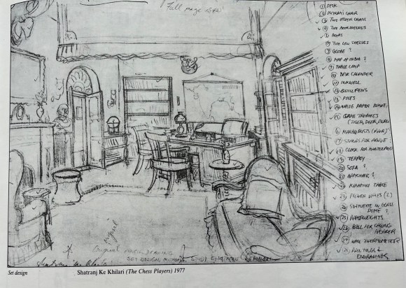
We turned our attention to his iconic crimson books, neatly stacked in his study. These well-known volumes are a treasure of Ray’s meticulous preparatory work—filled with detailed sketches for his films, costume and set designs, makeup instructions for his makeup artist, architectural notes, and an astonishing range that gave glimpses into his thought and work process.
We did not want to remove any drawings from these precious notebooks. He selected the drawings that he liked and decided he would ask Nemai Ghosh (1934-2020), his close associate and long-time photographer, to photograph them for the exhibition.
Several drawings, having come loose from the notebooks, were used in their original. We did not want to remove any drawings which were firmly in place in these volumes. Ray identified the drawings that appealed to him and Ghosh photographed them.
Part two of the exhibition was titled “Drawings and Sketches For Films’ and it comprised of both originals and the photographs by Nemai Ghosh of the drawings chosen by Ray.
I nudged him further and asked if there was anything else he might suggest from his visual repertoire.
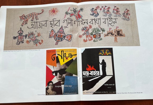
He thought of his film posters. The ones readily available in his flat were posters of Nayak and Ghare Baire, which were loaned for the exhibition. He was particularly eager to include the poster of Devi, but after searching, he discovered he only had one copy and was reluctant to part with it.
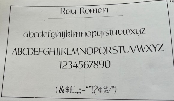
We tried to include artworks which would represent the different aspects of his visual repertoire. It seemed there was no end — typefaces he had designed, advertising campaign when he worked for D.J.Keymer. While searching he realised he did not have the originals of the typefaces he had designed but fortunately they had been preserved in the photographs taken by Nemai Ghosh. Later Paritoshda told me that he was given an award for the typeface by an American foundry and named it after him, Ray Roman.
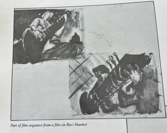
An album was discovered containing a silent film he had conceptualised on paper but never brought to life—a silent film on Ravi Shankar with his music in the background. The album, composed of monochromatic black watercolours, was photographed by Nemaida. It drew great interest, offering a first-ever glimpse into a project that was never realised.
Paritoshda advised that Ray had composed music for many of his films. A tape with his compositions was playing continuously and softly in the background at the exhibition.
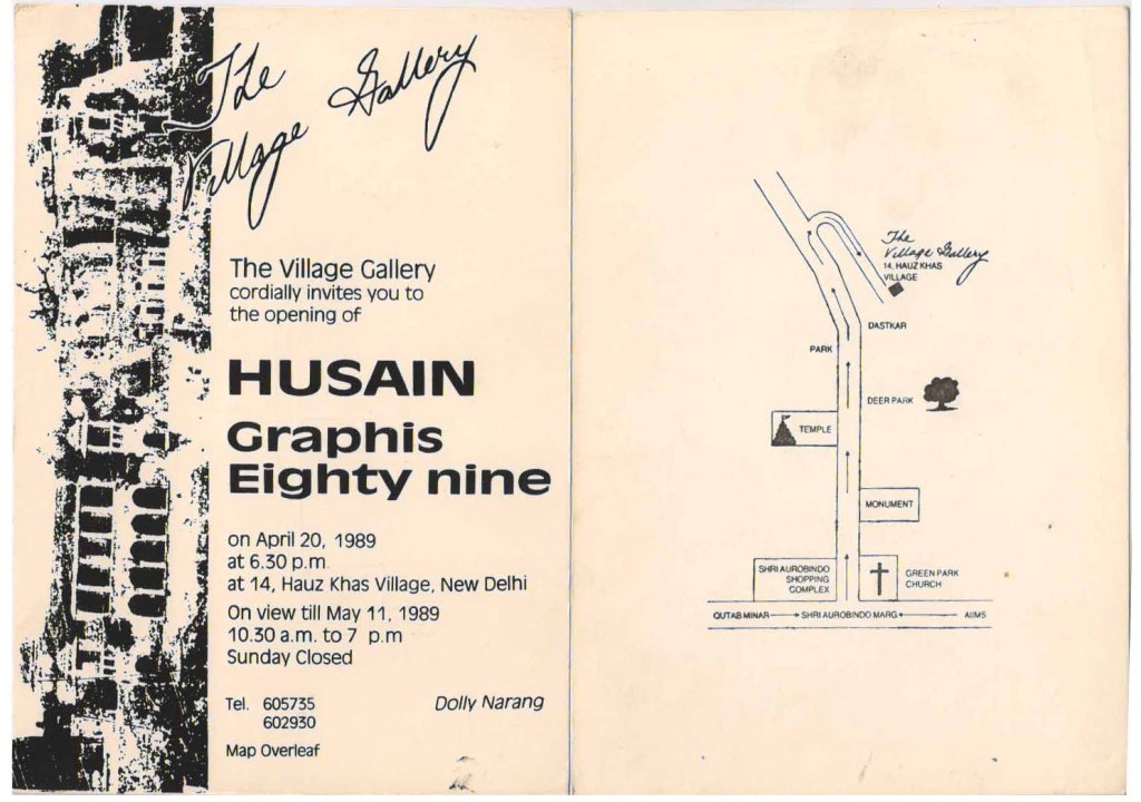
The exhibition was presented in two parts each had a duration of three weeks. Part one was devoted to his Graphic design, drawing and part two was about his preparatory sketches for films.
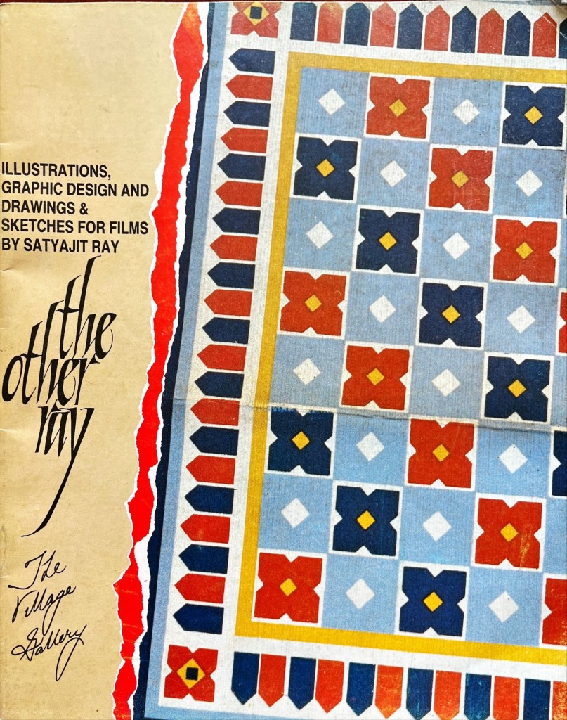
I requested Paritoshda to write an article for the exhibition catalogue, to which he graciously agreed. He penned an insightful essay which was appreciated by Ray himself as well as by fellow artists, critics, and visitors who found his insights both illuminating and deeply engaging. When I asked him for his suggestion for a title for the exhibition, he thoughtfully suggested — “The Other Ray” — a title both fitting and meaningful.
With the socio-political upheavals around us in Delhi, it wasn’t easy—cataloguing, printing invitation cards, framing, arranging transport to distribute the invitations. Invitation cards from our mailing list of over one thousand had to be hand delivered.
I asked Manikda for names of his friends and associates who he would like invitations to be sent to. His list included names both in India and abroad.
About a week before the event, I visited AIFACS[3] to put up a poster for the exhibition. To my surprise and delight, sitting in one of the exhibition halls was none other than M.F.Husain himself. It felt like a godsend—an unexpected opportunity to personally invite him.
He was visibly excited upon hearing about the exhibition and expressed interest in seeing the artworks immediately wherever they were. I explained that the pieces were still at home and would be better appreciated once they were displayed on the gallery walls. But he was insistent—he wanted to see them right away. We got into my car and drove to my house. Husain viewed the works in thoughtful silence moving from work to work, looking at each with great interest. After perusing them keenly he settled at the dining table and began reminiscing about his association with Ray – a moment as historic as it was moving, etched forever in my memory.
I was not prepared with either a tape recorder or a camera to record this memorable encounter. Fortunately, The Illustrated Weekly, under editor Pritish Nandy, later published his reflections in an article spread over two pages with several illustrations of his graphic work.
Opening to the Public
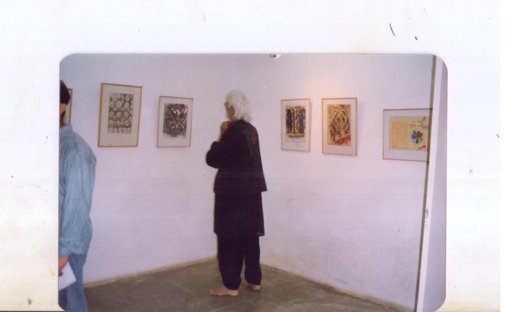
When the exhibition finally opened at The Village Gallery in New Delhi’s quaint Hauz Khas Village it was received with great enthusiasm and acclaimed by both critics and the public
Visitors from all walks of life came to see the “ The Other Ray”. For many, it was a revelation. The same legendary filmmaker who had given the world The Apu Trilogy had also crafted whimsical illustrations for children, designed book jackets, created typefaces. It was exciting for them to get a peek into his creative process as a filmmaker through his detailed film sketches.
I made another trunk call to inform him that the article in the brochure by Paritosh Sen had been chosen for The India Magazine’s cover story. The next day, when I spoke to him again and offered to send him a copy of the magazine, he responded with excitement. He said he couldn’t wait and had already gone to the market to buy a copy for himself.
Once the exhibition—having stirred great excitement in the art world—came to an end, it was finally time to take it down. The last few days were deeply moving. Visitors lingered, often spending long hours in the gallery, reluctant to leave, as if trying to hold on to the experience a little longer. The space was filled with quiet reflection and enriched by heartfelt exchanges.
Looking back, organising this exhibition remains one of the most fulfilling experiences of my life. What I cherish is the memory of the many hours spent in his study carefully selecting the works for the exhibition. It was a collaborative process, he was open to my suggestions yet he became more and more involved as he delved deeper into his graphic work.
An idea, carefully nurtured, took shape as an exhibition. What was especially fulfilling about the exhibition was how it brought to light a lesser-known facet of Ray’s creative genius—his remarkable visual imagination, his penchant for details, his industriousness. Until this exhibition, only a few of his sketches had appeared in articles and books, leaving much of this work largely unseen. The display offered audiences a rare and intimate glimpse into his visual world as well as his work and thought process, making it especially significant.
The final step was to return the works. I personally placed each delicate sheet into thin plastic sleeves, compiled them into a portfolio, and flew to Calcutta to return them to the master. True to his dignified demeanour, he received the compilation with quiet pleasure. He expressed both satisfaction and a hint of surprise at the enthusiastic response the exhibition had received. I took the liberty of asking him if I could keep as a memento two works from each part of the exhibition. He readily agreed and asked me to choose. I selected one black white illustration for Sandesh and credit title from his film Sonar Kella (The Golden Fort, 1974) . One more request — Could he sign these please? To which he graciously agreed.
As I took my leave, I shared a thought—could we perhaps work on a sequel to The Other Ray? He received the idea warmly, but unfortunately, it never came to fruition. He soon became immersed in Agantuk (The Stranger, 1991), and not long after, his health began to decline.
As I write this, memories come rushing back, and I find myself tempted to echo Manikda’s words of my experience that “I had forgotten I had done all this work.”
Ray’s Note in the Brochure:
My grandfather was, among other things, a self-taught painter and illustrator of considerable skill and repute, and my father — also never trained as an artist — illustrated his inimitable nonsense rhymes in a way which can only be called inspired. It is, therefore, not surprising that I acquired the knack to draw at an early age.
Although I trained for three years as a student of Kalabhavan in Santiniketan under Nandalal Bose, I never became a painter. Instead, I decided to become a commercial artist and joined an advertising agency in 1943, the year of the great Bengal famine. Not content with only one pursuit, I also became involved in book designing and typography for an enterprising new publishing house.
In time I realised that since an advertising agency was subservient to the demands of its clients, an advertising artist seldom enjoyed complete freedom.
This led me to the profession of filmmaking where, in the 35 years that I’ve been practising it, I have given expression to my ideas in a completely untrammelled fashion.
As is my habit, along with filmmaking, I have indulged in other pursuits which afford me the freedom I hold so dear. Thus, I have been editing a children’s magazine for thirty years, writing stories for it and illustrating them, as well as illustrating stories by other writers.
While preparing a film, I’ve given vent to my graphic propensities by doing sketches for my shooting scripts, designing sets and costumes, and even designing posters for my own films.
Since I consider myself primarily to be a filmmaker and, secondarily, to be a writer of stories for young people, ·I have never taken my graphic work seriously, and I certainly never considered it worthy of being exposed to the public. It is entirely due to the tenacity and persuasiveness of Mrs. Narang that some samples of my graphic work are now being displayed. Needless to say, I’m thankful to Mrs. Narang; but, at the same time, I must insist that I do not make any large claims for them.
SATYAJIT RAY
The Consummate Artist by Paritosh Sen (1918-2008)
(Republished from the brochure of “The Other Ray” exhibition)
It was the summer of 1945. I was holding my third one-man show and my first in Calcutta. On the third day of the exhibition, Prithwish Neogy (a brilliant scholar, now heading the Department of Asiatic Art at the Honolulu University) entered the exhibition hall accompanied by an extraordinarily tall and swarthy young man. I had known Prithwish earlier. The latter was introduced to me as Satyajit Ray. I was vaguely aware of him as the only son of the late Sukumar Ray, the creator of a unique body of nonsense rhymes and humorous prose remarkable for their originality of vision and an extremely sharp intellect and imaginative power. Satyajit was also known as the grandson of Upendra Kishore Ray, one of the inventors of half-tone block making, a pioneering creator of a sizeable body of children’s literature and the founder of the well-known children’s magazine, Sandesh, and a painter of no mean talent either.
Satyajit was then doing a course in painting in Santiniketan under the very able guidance of Benode Behari Mukherjee, a great artist and an equally great teacher. Besides, Ray had also the unique opportunity of coming in close contact with Nandalal Bose, the guru of both Benode Behari and Ram Kinkar, undoubtedly the foremost sculptor of contemporary India.
Earlier he had also received the blessings and affection of Rabindranath Tagore. Although he did not complete the art course in Santiniketan, the experience of being surrounded by these great artists and the unique rural setting of the Santhal Parganas, as portrayed by these artists and the poet, enabled Ray to appreciate nature in all its diverse and glorious manifestations and opened his eyes to the mysteries of creation. This single unprecedented and cherished experience helped him to formulate his ideas about the visual world and to unlock doors of visual perceptions. Added to this was his study and understanding of the classical and folk art, dance and music of our country. The magnificent collection of books in the Santiniketan library of world art and literature also helped him to widen his horizon. It was here that he read whatever books were available on the art of cinema. The seeds of a future design artist and a filmmaker were simultaneously sown here.
Having lost his father early in life, the need for earning a livelihood assumed enough importance to make him leave Santiniketan prematurely and look for a job in the field of advertising art or, as it is better known in modern parlance, graphic design. A latent talent is bound to make its presence felt sooner or later, whatever be the chosen field. As Tagore said in one of his early verses, “Flowers in bloom may remain hidden by leaves but can they hide their fragrance?” Satyajit Ray was appointed by the then D.J. Keymer (now known, as Clarion Advertising Services Ltd.) as a visualiser-cum-designer, often executing the finished design or an entire campaign himself.
Together with two of his contemporaries, O.C. Ganguli and Annada Munshi, Ray was trying to evolve certain concepts not only in illustrations but also in typography which would give their design an overall Indian look. One recalls those highly distinctive newspaper and magazine ads, the magnificent calendars, posters, cinema slides and what not of the late ’40s and ’50s not without a certain nostalgia. If my memory does not fail, I think some of the works of these three artists were even published in Penrose Annual and elsewhere. Here it may be worthwhile to bear in mind that the style evolved by these three artists made a welcome departure from the dull academicism and the stereotypes being practised by most of the advertising agencies of those times. The freshness and vigour displayed in their approach was readily appreciated both by their employers and their clients. Ray was particularly strong in the difficult area of figure drawing, an area in which many graphic designers were found singularly wanting.
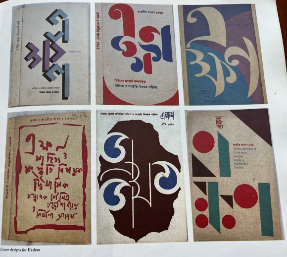
Although he was soon to move away from commercial art to embrace his new-found love of filmmaking, he would continue to remain an illustrator of the first order as would be evident from his emergence as a story-teller in the two popular genres of detective and science fiction. (Not many outside Bengal know that Ray’s literary output is in no way less than that of his cinema and that most of his books have already run into thirty to thirty-five editions). He has not only been illustrating his own stories, but over the years he has been designing the covers of his grandfather’s once defunct children’s magazine Sandesh, revived by him nearly two decades ago, which also carried many illustrations by him. But in my opinion his most cherished field is calligraphy, whether that be of the pen or brush variety.
This art he imbibed from his guru Benode Behari Mukherjee. Over the years he had also been studying the art of typography with the scrutinising eye of a highly creative calligrapher. The result has been a series of innovations in both Bengali and English lettering evolved for posters, banners and book covers. These very original works gave a tremendous fillip to graphic design in general and book, magazine and record covers in particular, especially in Bengal. The books Ray designed for the now defunct Signet Press of Calcutta way back in the early ’50s set new trends and were considered as models for book production both in terms of page layout, typography and jacket design, the last being his chosen field where, as I said earlier, his innovations have known no bounds. The covers of the well-known literary magazine Ekshan, which he has been designing for many years, to give only one instance, bear ample testimony to his apparently playful but significant experiments with the forms of three Bengali letters which constitute the name of the magazine. The wide variety of his inventiveness is one of his great achievements in the field of cover design.
Then there are the posters, banners and slides he designed for his own films. These too were eye openers and instant trend setters. Who can ever forget the huge banners and billboards of the Apu trilogy put up at important street junctions of Calcutta! Their freshness of ideas, design concepts and calligraphy were not to be missed even by men and women in the street. Simultaneously with his creative outburst in the art of cinema, his creativity in graphic design reached new heights. What was remarkable was the fact that Ray imminently succeeded in investing all these works with a highly distinctive Indian flavour derived from his awareness of our folk traditions (especially 19th century Bengali book illustrations and woodcut prints of decorative lettering) both in their linear vigour and simplicity as well as in ornamentation.
One of the most outstanding examples of this approach was the publicity material he designed for Devi. The underlying theme of the title expresses itself forcefully both in the highly imaginative design of the lettering and the image. Their fusion is perfect. Not many graphic designers have been as type conscious as Ray. He personifies the printing designer’s gospel “type can talk”. That a letter or a printing type is not only a sign but an image by itself, and if appropriately employed can have immense communicative power and is capable of expressing a whole range of human emotions was known to Ray from the very beginning of his career.
In the enormous range of Roman printing types there are many in the humanist tradition in their simple aesthetic charm, warmth of feeling as well as in their highly elegant but delicate anatomical details. There are also those which are severe, powerful and cold but nonetheless are highly attractive in their own ways.
It is often overlooked by most readers that a letter’s structure and anatomy can be reminiscent of things in the visible world, both natural and man-made. Some can have the gentle rhythm of the rise and fall of a female form, others may have the majestic look of a well-designed edifice-just to give only two similes. Ray not only bore all these considerations in mind but used his calligraphic knowledge, skill and innovative power to their full advantage when he designed the three printing types called Ray Roman, Daphnis and Bizarre for an American type foundry nearly two decades ago.
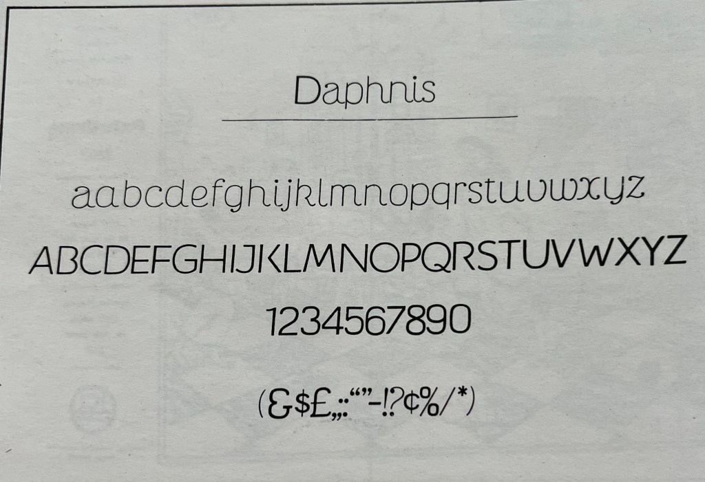
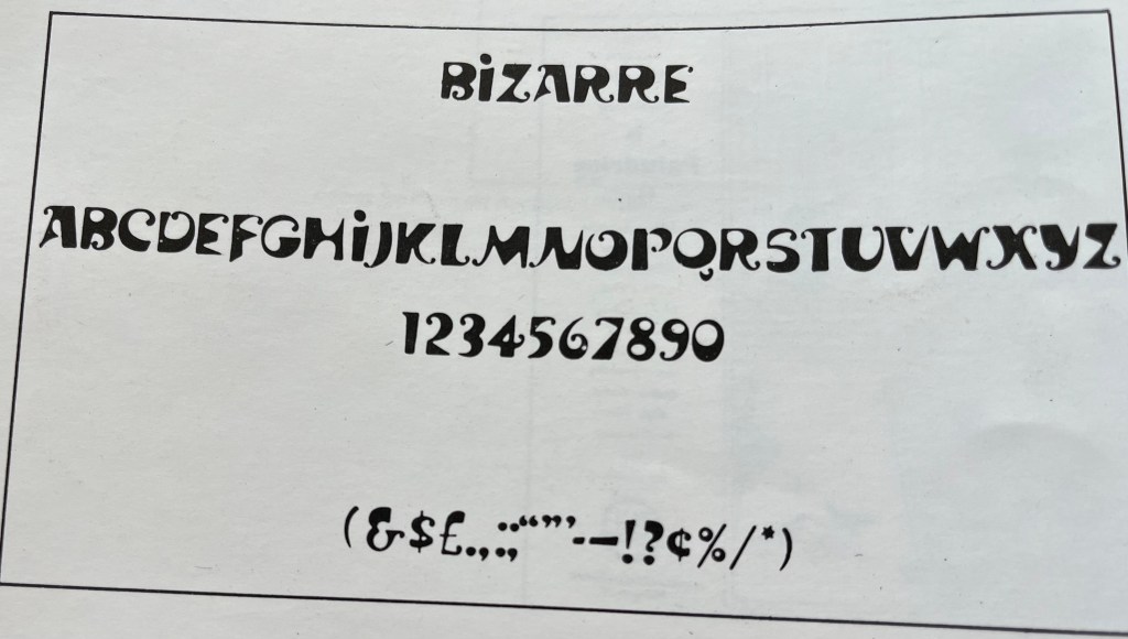
Not many of us know the infinite patience, rigours, discipline and the endless process of trial and error involved in designing a whole series of a printing type. That, in spite of his other demanding preoccupations, he found enough time to design three complete sets of types bears ample proof of his diligence and perseverance and his passionate love for the world of types. Those of us who have known him over the past decades are profoundly admiring of the fact that he is a workaholic in the best sense of the term. His diverse creative output is staggering and would put many a man half his age to shame.
In the ’40s, I met Satyajit periodically as I worked as an art master in Indore. One of the high points of my visits to Calcutta during the long summer or the short winter holidays was to frequent his ground-floor apartment in South Calcutta. It was at his place I first listened to TS Eliot’s recital in the poet’s own voice of The Waste Land which was just brought out by HMV (now known as EMI). It was on such visits I would also have an opportunity to listen to his latest collection of records of European classical music. And it was also on one of such occasions I first heard him toying with the idea of making a film based on Rabindranath Tagore’s novel, Home and the World, a project which was abandoned soon after and was finally realised nearly four decades later.
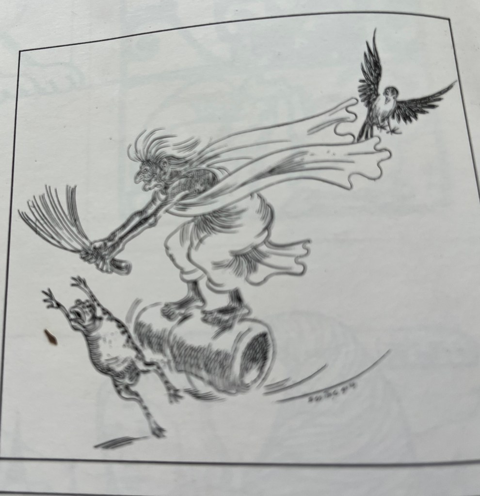
It was not before1 returned home in 1954 after a five years’ stint in Paris that I came to know of his intense involvement with the making of Pather Panchali[4]. I vividly remember to this day the excitement with which he described it to me and invited me to a screening of the rushes. He brought out all the sketches and doodles he made along with side notes in Bengali not only of the dress, props and characters in the script but also very quick but masterly sketches of frames of each of the sequences, camera movements, etc. I remember asking him why he thought it necessary to make such careful preparations before shooting. To which his quick but significant reply, “One of the foremost but very difficult things in filmmaking is to determine the placement of the camera.” He was equally quick to point out that this is only the first part of shooting a movie and not stills.
Those of us who watched him in action know only too well that although there is always a professional cameraman present in his unit, in reality he becomes the cameraman himself. The visual richness of a film is as important to him as a story well told — the one being inseparable from the other. This is the most distinctive feature of his artistic achievements in all his films.
Ray is a lyricist of the highest order. From his first film Pather Panchali to his latest Shakha Prashakha[5], this lyrical bend binds all his films together in the form of an oeuvre and finds full fruition in his most recent work.
Some of the imperceptibly slow camera movements in this film are sheer poetry. Although not yet released, I had the opportunity of seeing it twice, and apart from anything else, I as a painter was bowled over by its visual richness and its consummate technical finesse. I have reasons to say this. Whenever I see a movie, I try to see it through the lens of the camera and having witnessed many film shootings of some of Ray’s films, it has become a habit with me to follow the movements with great fascination. Thus, it helps me greatly to enjoy watching a film from the aesthetic and technical viewpoint.
I am sure that in order to achieve maximum artistic quality Ray finds the preliminary exercises made primarily in pen and ink very useful. These small and simple sketches, evidently done in quick succession, have all the spontaneity and vigour of something impeccably visualised and bear the unmistakable stamp of a born lyricist. Their linear treatment, unorthodox positioning on paper and an apparent insouciance, at any rate, in my eyes, are the products of a highly creative mind and are designed to meet the needs of a fastidious aesthete.
Among the sketches, one comes across portraits of many of the characters in his films in various moods and postures. These could easily be rated as some of his best works in this group. Only someone with consummate skill can bring out the full characterisation in a postage-stamp format with utmost economy and clarity. The lines which define the contours and other details of the figures are free flowing, sure and firm, the result of years of practice both with the pen and the brush.
One of the most interesting exhibits in the present collection is the album containing one of his earliest essays in visualisation of a film project — the documentary he once wanted to make on Ravi Shankar playing the sitar and on the tabla accompaniment. Ray showed it to me as early as 1954. It is possible that the inspiration came from his viewing Uday Shankar’s ballet film, Kalpana (Imagination) -– a film which he studied frame by frame by taking scores of stills in the dark theatre where the film was released. He showed me the entire series one by one and pointed out among other things the unusual camera angles, the dramatic lighting, the magic of black and white, especially in the close-ups of both the dancers and the tabla playing. Although the Ravi Shankar film was never released, I think Ray thoroughly enjoyed the exercise and learnt a lot from it.
This, along with numerous sketches and doodles related to his films, will ever be regarded as something unique in the history of filmmaking in our country.’ Only a few’ and they can be counted on one’s fingers, in world cinema have been such gifted artists too like Eisenstein, Kurosawa, Fellini and a few others. The Village Gallery should be congratulated for presenting to us “The Other Ray – the Consummate Artist.”
[1] Is Satayjit Ray there?
[2] Lila Mazumdar ( 1908-2007, a well-known Bengali writer of children’s stories)
[3] The All India Fine Arts and Crafts Society
[4] Song of the Road,1955
[5] Branches of a Tree, 1990
Dolly Narang, a gallerist, has conceptualised innovative pathbreaking exhibitions. A recent student of sculpture, she has the satisfaction of experiencing both personal and spiritual evolution as a Pranic healer and as a grandmother.
.
PLEASE NOTE: ARTICLES CAN ONLY BE REPRODUCED IN OTHER SITES WITH DUE ACKNOWLEDGEMENT TO BORDERLESS JOURNAL
Click here to access the Borderless anthology, Monalisa No Longer Smiles
Click here to access Monalisa No Longer Smiles on Kindle Amazon International